Easybank Landing Page using ReactJS and SCSS
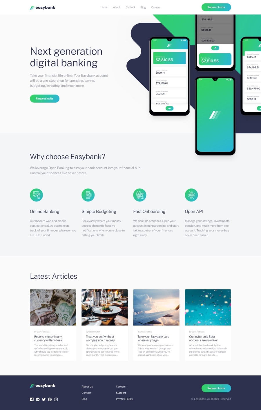
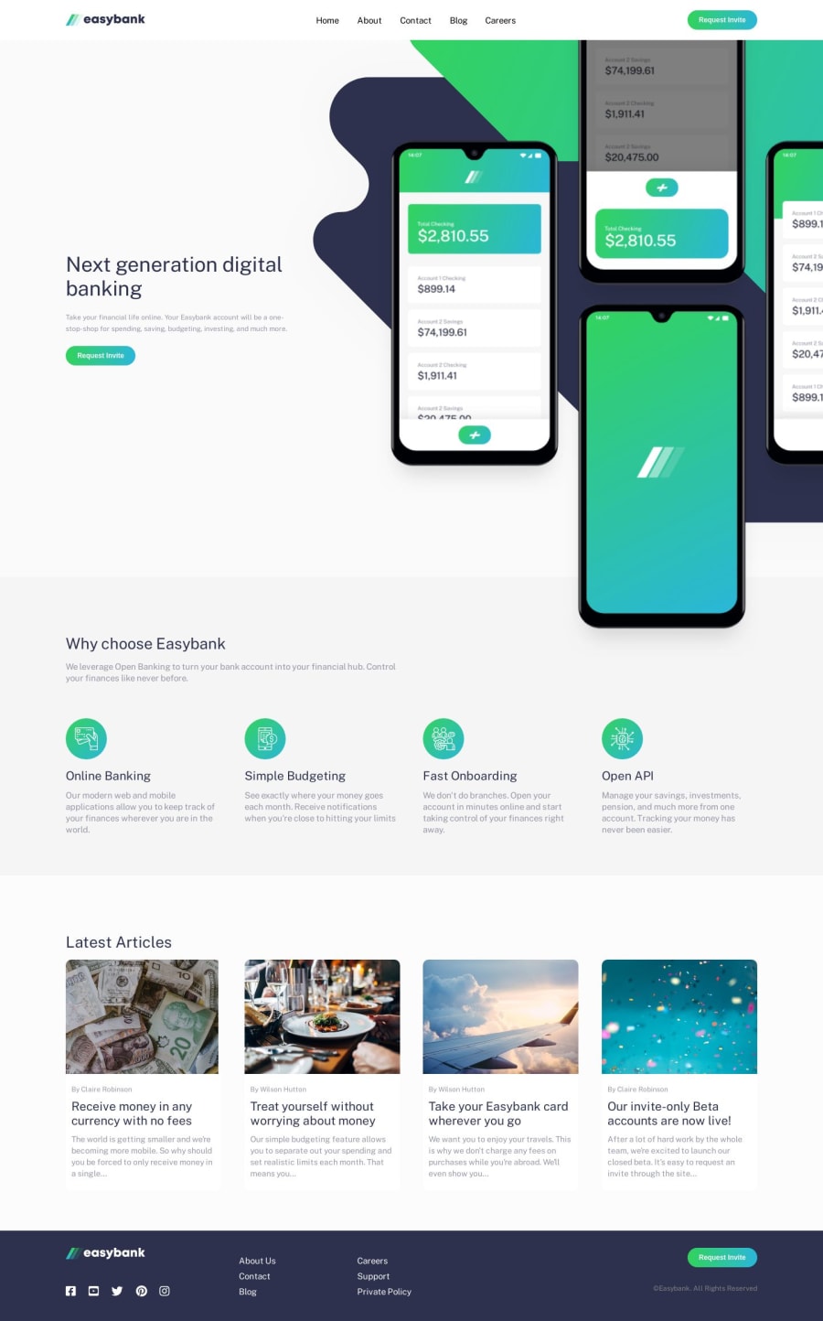
Design comparison
Solution retrospective
Recommend ways to improve. Feedback will be greatly appreciated.
Community feedback
- @emestabilloPosted about 4 years ago
Hi Militus, your project looks good and quite responsive. Just a few tweaks to get it even closer to the design:
- The CTAs are missing their hover states
- The design seems a little cramped laid out at
768px
. Increasing the breakpoint would probably make it look better. My opinion :-) - For the mobile nav, I like the animation on the icon! But I think the
transition-delay
onnavbar__mobile
makes for a longer wait for the menu to close. There's also some 'jumping' as theoverlay
is applied. - The background on the
article
section is a little off. The cards are not standing out as opposed to the design - The
article__card
s lose their border-radius in medium widths, and at times appear in different lengths - Lastly, a more semantic html structure would be a great addition
Hope this helps! :-)
1 - @BeardedArtistPosted about 4 years ago
This looks great!!
One part that you could improve on is the first text "Next generational digital banking" and the picture next to it. For an advertisement page, the text should 'pop' a little more. and I would make the picture to the left a little smaller.
Same with the "Why choose Easybank". Customers eyes should be focused on these text areas since its the product information.
Otherwise, looks great!!
1@MilitusInnocentPosted about 4 years ago@BeardedArtist thank you so much. I will implement the change right away!
0
Please log in to post a comment
Log in with GitHubJoin our Discord community
Join thousands of Frontend Mentor community members taking the challenges, sharing resources, helping each other, and chatting about all things front-end!
Join our Discord