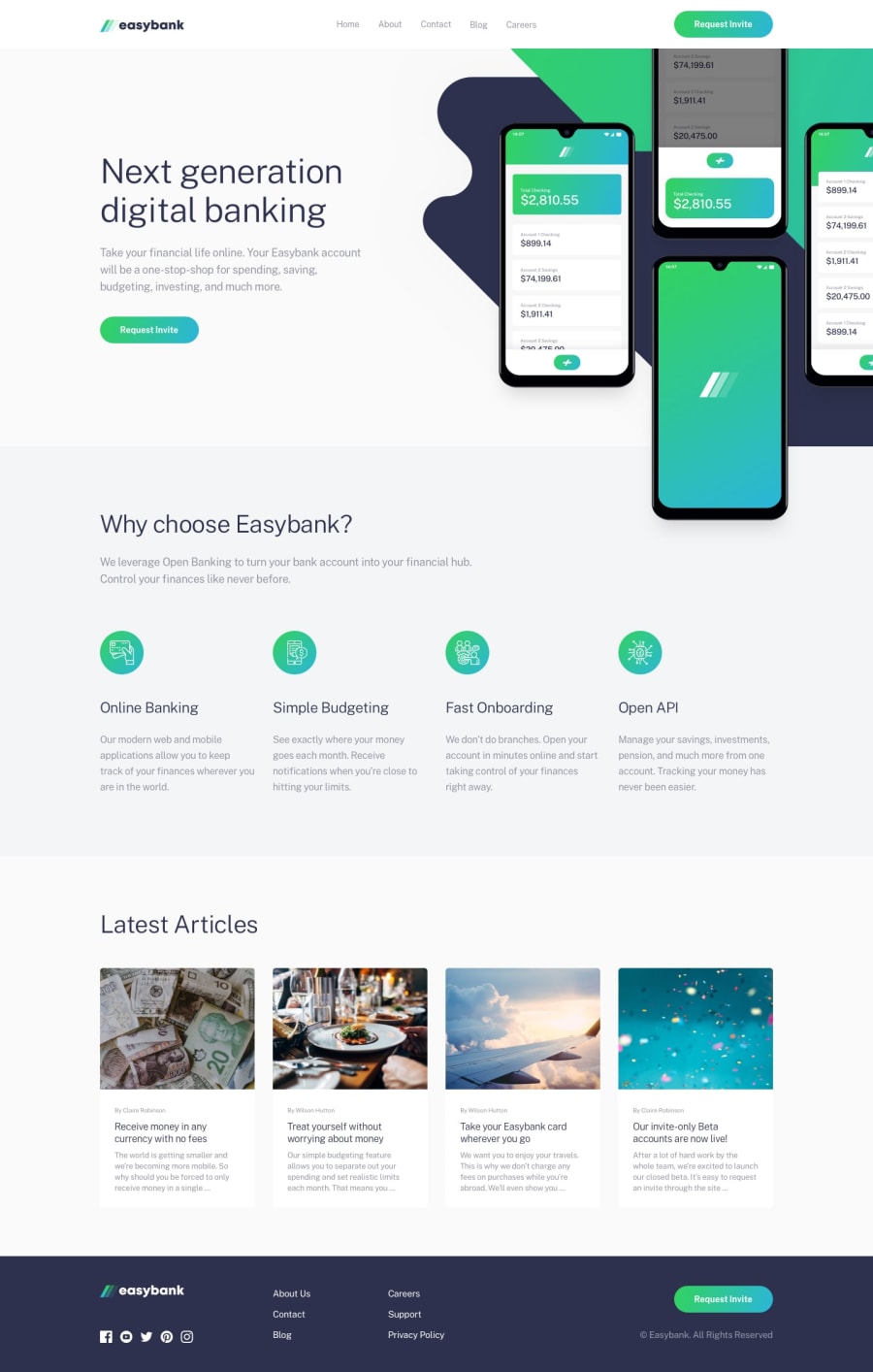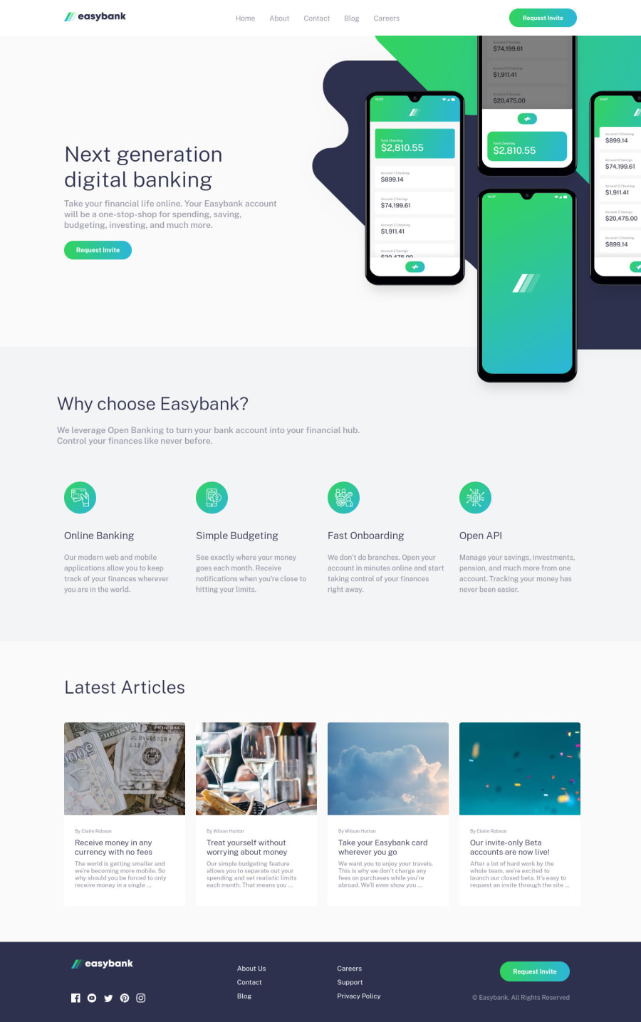
Easybank landing page using React, SCSS and mobile-first workflow
Design comparison
Solution retrospective
My first time using SCSS and functional components in React, how did I go? Please be as harsh as you can.
Community feedback
- @AlexKMarshallPosted about 3 years ago
This looks good at a lot of screensizes. But careful, you have some significant horizontal overflow on between about 800px and 1200px screen width. Also, on very large monitors, everything is a bit too wide for my tastes, I'd wrap the main content in a max-width container maybe capping it at about 1200px
The mobile menu doesn't appear to do anything.
Careful with your HTML. Your list of navigation elements should be
<nav> <ul> <li><a href="/">Home</a></li> <li><a href="/">About</a></li> </ul> </nav>
Also you have multiple h1 elements, we only want one on the page. And all other headings should flow in order. You need a
<main>
wrapping everything that's not the header and the footer. And<section className="footer">
should just be<footer>
For the React code. I see you have a
useEffect
which is setting up a listener to the resize event in order to apply different classes to some elements. Just use a media query to do that. We don't need javascript there. It's really poor for performance. If you do need the size of the window in the javascript for some reason (For some far more complicated use-case), then use theresize-observer
api as it is far more performant. But if something can just be done with CSS, do it with CSS.Other than that, there's no specific issues with the React code. Except that it doesn't really make that much sense to use React for something like this. It's fine to use this as practice with setting up React, but as it's a static website, with as far as I can tell no real javascript requirements, making the user download the full react bundle to run the site, is fairly poor UX.
The benefits of a framework like React or Vue come from either when you have heavy interactivity. Or when you have a lot of re-usable components. And there are neither of those here.
If you want to really practice React skills, then I would try some of the app challenges instead like the Tip Calculator or the Clock. Just make sure you've got a decent handle on semantic HTML as well.
Marked as helpful3@nkhatri7Posted about 3 years ago@AlexKMarshall Thanks so much for the feedback Alex! I'll definitely take a look into these things and implement them in my future code. And yeah I just wanted to practice my React skills but I guess there definitely are better challenges to practice that with.
0 - @Nick331102Posted about 3 years ago
how do you add a dark overlay to the body when the hamburger menu is clicked?
0@nkhatri7Posted about 3 years ago@Nick331102 I had a div with the class overlay and made that cover the screen with a background colour of
rgba(0, 0, 0, 0.25)
. I used z-indexes to layer the different elements.0
Please log in to post a comment
Log in with GitHubJoin our Discord community
Join thousands of Frontend Mentor community members taking the challenges, sharing resources, helping each other, and chatting about all things front-end!
Join our Discord