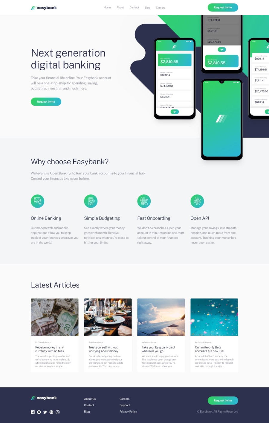
Easybank landing page using react js
Design comparison
Community feedback
- @Chromax-DPosted about 2 years ago
the solution looks good on the desktop view... But the responsiveness may need some adjustments. Also, there are no hover states for your buttons.
Then for your latest article images, Give them a property a css property of {object-fit : cover}. This will enable all images to fill their containers.
And finally bro, try and learn css grids well... It will help you in creating better responsive designs. Learn how to use the minmax() property... It will not only save you the stress of writing many media queries, it will also make your work neater. Thanks bro!
0@TobianointingPosted about 2 years ago@Chromax-D thanks for the feedback I really appreciate.
0
Please log in to post a comment
Log in with GitHubJoin our Discord community
Join thousands of Frontend Mentor community members taking the challenges, sharing resources, helping each other, and chatting about all things front-end!
Join our Discord
