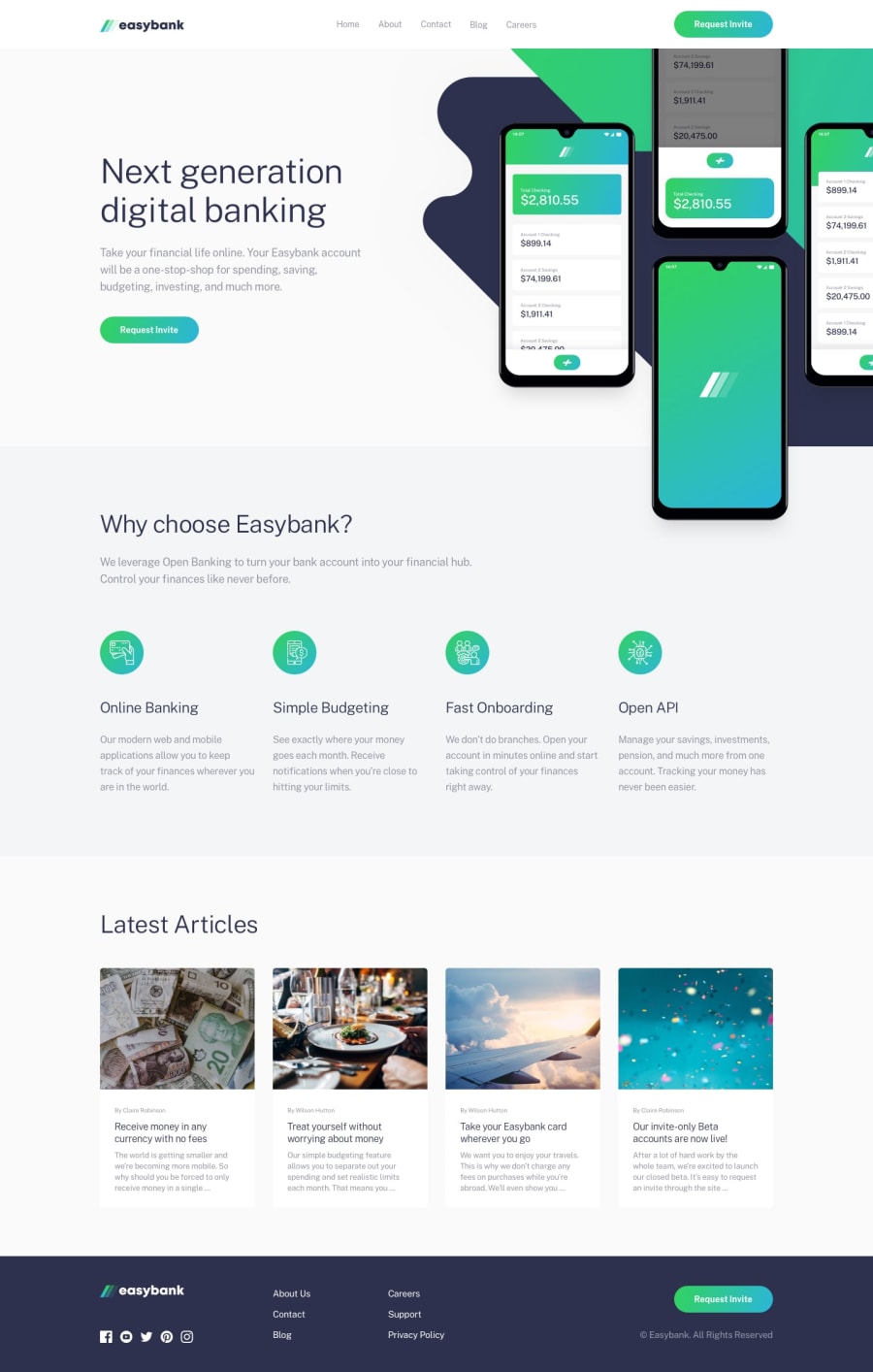
Design comparison
SolutionDesign
Solution retrospective
What challenges did you encounter, and how did you overcome them?
The hero section gave me a bit of trouble because of the different overlaps on the top and bottom border. Ended up using position: absolute and a positive z-index on the navbar then gave the hero section a bit of margin on the top
Community feedback
Please log in to post a comment
Log in with GitHubJoin our Discord community
Join thousands of Frontend Mentor community members taking the challenges, sharing resources, helping each other, and chatting about all things front-end!
Join our Discord
