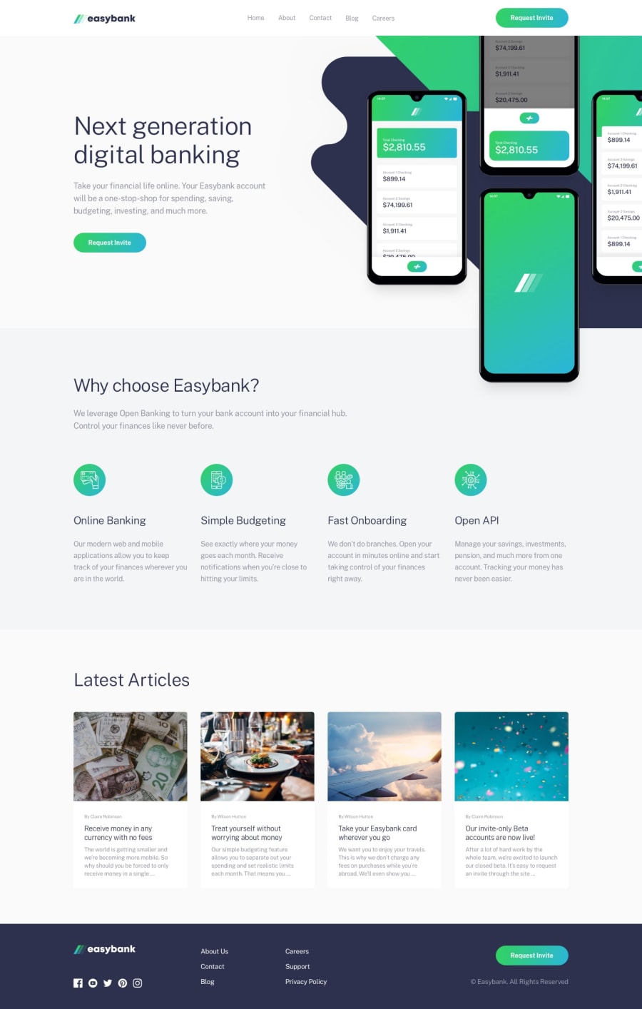
Easybank landing page using React & Styled Components
Design comparison
Solution retrospective
I accept suggestions
Community feedback
- @rfilenkoPosted over 4 years ago
Hey, great work, to avoid header links on hover - add transparent border-bottom, not you have it on hover as well, and definately use transition for buttons, links. Also work on those error in the report.
Cheers, Roman
0 - @ramsaysewellPosted over 4 years ago
Hi Juan,
This looks great, well done.
I would be picky and say that the hover affects could be given a
transitionproperty to improve the hover effects.I noticed on your social icons in the footer, you have:
.className svg path:hover {
   fill: green;
}
However, the hover only occurs when you are hovering over part of the icon (that has a path). To slightly improve the UX, you can do this:
.className svg:hover path {
   path: green;
}
Meaning that when you hover over the
<svg>element, you want the path to change fill.Well done and happy coding!
0
Please log in to post a comment
Log in with GitHubJoin our Discord community
Join thousands of Frontend Mentor community members taking the challenges, sharing resources, helping each other, and chatting about all things front-end!
Join our Discord
