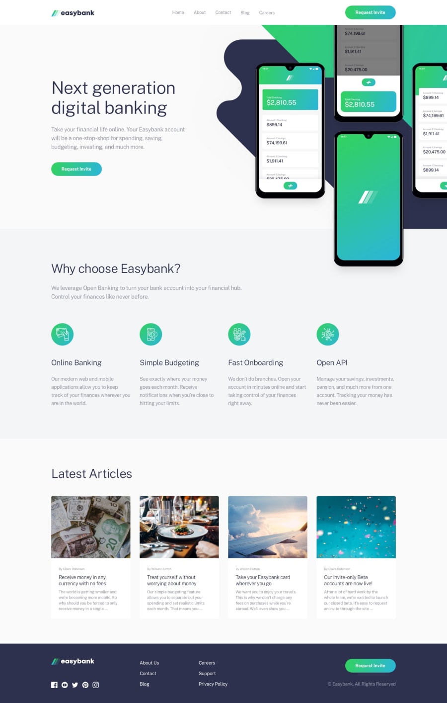
Design comparison
SolutionDesign
Solution retrospective
Finally completed this challenge. Please any feedback will be appreciated.
Community feedback
- @ezechukaPosted over 2 years ago
Well done chief! Your CSS looks neat. However, I do have some suggestion. On the mobile menu, the links doesn't show because the text-color is white.
You can change it from this:
.nav-links-container li {
        color: var(--dark-blue);
        font-weight: 500;
    }
to this:
.nav-links-container li a {
        color: var(--dark-blue);
        font-weight: 500;
    }
And it should work.
Also nice job chief :)
Marked as helpful1@JesseOlisaPosted over 2 years ago@ezechuka Oh!! 😅 Thank you so much for the heads up I will update it now
1
Please log in to post a comment
Log in with GitHubJoin our Discord community
Join thousands of Frontend Mentor community members taking the challenges, sharing resources, helping each other, and chatting about all things front-end!
Join our Discord
