
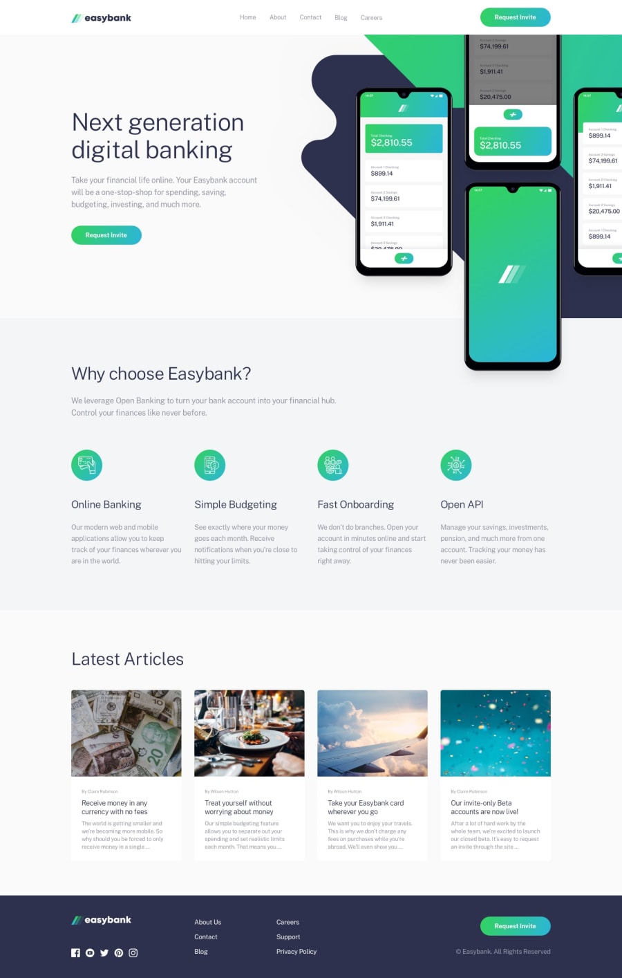
Easybank landing page using HTML, CSS and JS


Design comparison
Solution retrospective
Pls provide feedback And also, Pls tell me how I can improve I will be very grateful to hear from you...
Community feedback
- @ericsalviPosted over 3 years ago
I'd also check out the images on desktop as they all appear to get squished and not stay in the original ratio. This is for all images on the desktop version of the site.
1@Ernest2026Posted over 3 years ago@ericsalvi what can i to to avoid this please...
0@ericsalviPosted over 3 years ago@Ernest2026 The easiest rule for keeping images in the correct constrained proportions is to not set a pixel/percentage value for both the height and width of an image. It is best to only set the width and then set the height value as
auto. What this will do is keep the exact proportions of the width and height of the original image and just adjust the width according to what you set, and the height will automatically adjust with it.For the latest articles, you could set the width of the images to 100% and then leave the height set to auto. Right now you only have a height value you set. If you do this, however, the bottoms will all be different. One best practice for needing the container for the image to be the same sizes for all items in that section is to instead set the image as a background image through CSS (inline) and then set the size of the background image to
cover. You then set the exact width and height of the container to your liking.For the top floating image, you might be able to work out using
autofor the height as well. It will be more responsive and not look squished on different screen sizes.0@Ernest2026Posted over 3 years ago@ericsalvi thank you very much sir, I appreciate...
0 - @pikapikamartPosted over 3 years ago
Hey, great work on this one. The layout in desktop is good, resizes well and the mobile state is good as well.
Some suggestions would be that:
-
Your navbar links should be wrapped inside their own
atags and not just inlitags. Since they are links right, they should be nested with it. -
Your buttons should have a
:focusstate because you have removed theoutlineproperty. This outline helps user to see where they are at in your website especially when using keyboard. If you remove this, use the:focusand add some custom visual indicator likebox-shadoworborder. -
Too much usage oh heading tags. There are text which should not be wrapped inside heading tags. Like the second text in the hero box, the second text after the "why choose easybank", the four text in the four circles, lastly, the last 4 text on the article sections. Those mentioned should just only been wrapped inside
ptags. Because if you made it all heading tags, users who use text-to-speech will have a hard time using your website, thus somehow disabling them. -
On the article sections, those 4 article should have been inside
atags or their respective title should have been insideatags, because they are supposed to be links to the article itself. -
On the footer, social media icons should be wrapped inside as well in
atags because they are social media links. Also the footer text links, need to be insideatags. -
On the mobile state, your navbar dropdown hamburger needs to be inside
buttonbecause this will really help assistive tech, linking them in the control which is the hamburger button is for.
But still, good job on this one ^
1 -


Please log in to post a comment
Log in with GitHub
Join our Discord community
Join thousands of Frontend Mentor community members taking the challenges, sharing resources, helping each other, and chatting about all things front-end!
Join our Discord