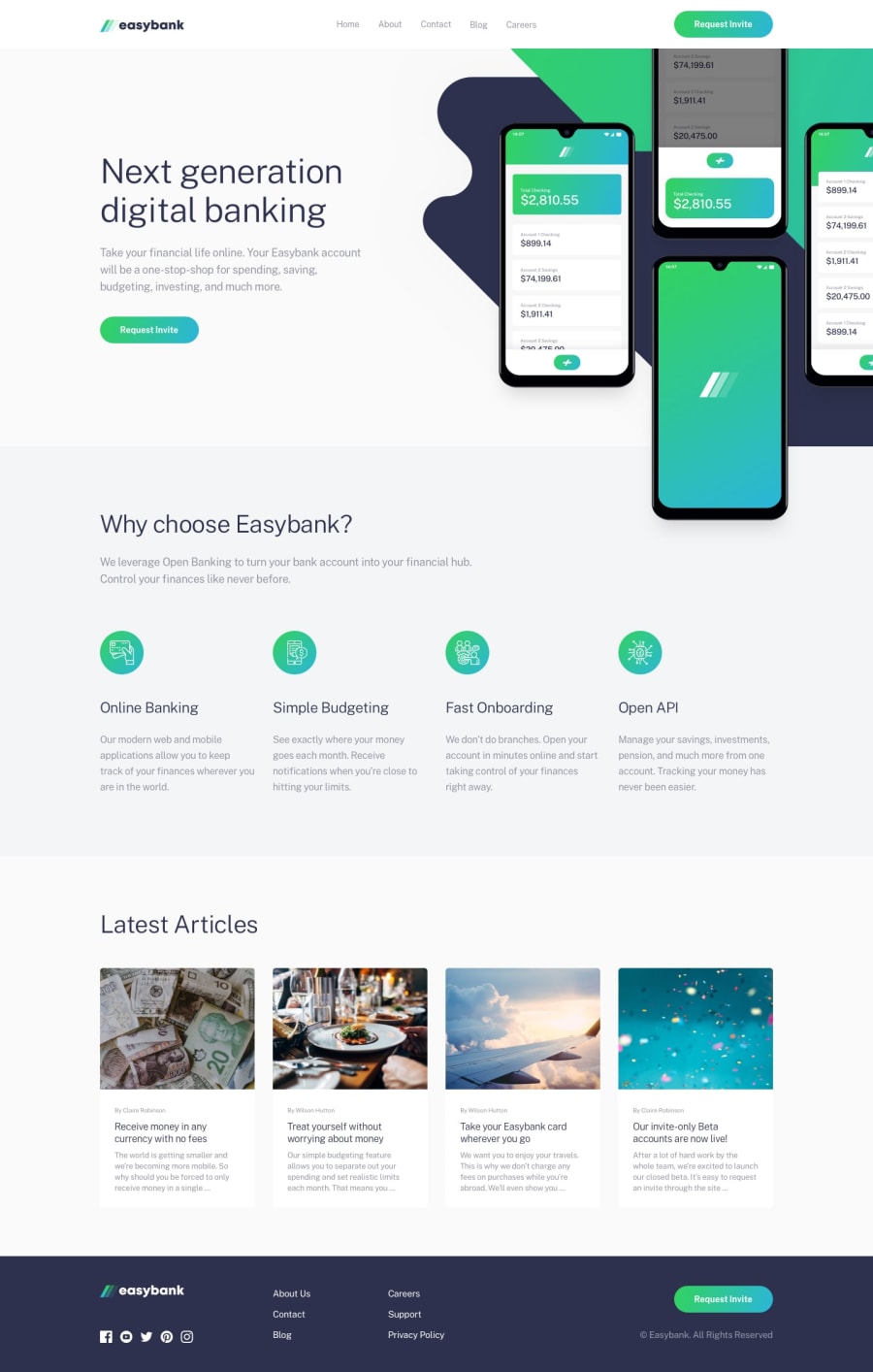
Design comparison
SolutionDesign
Solution retrospective
Any form of feedback on how to improve my code quality is welcome.
Community feedback
- @Meauma13Posted over 2 years ago
Hi, Ikenna. Nicely done.
However, your cards don't seem to be highlighted or outlined or have shadows so they appear prominent. Just a tweak of your code should do it.
Also, I guess a lot of us forget about landscape orientation mode during design. You may need to write a few lines of media query to address it.
Great work, still.
Marked as helpful0
Please log in to post a comment
Log in with GitHubJoin our Discord community
Join thousands of Frontend Mentor community members taking the challenges, sharing resources, helping each other, and chatting about all things front-end!
Join our Discord
