Submitted over 1 year ago
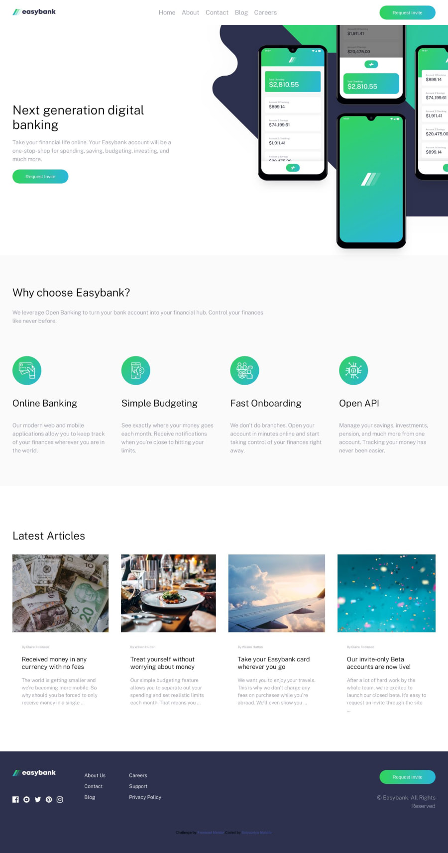
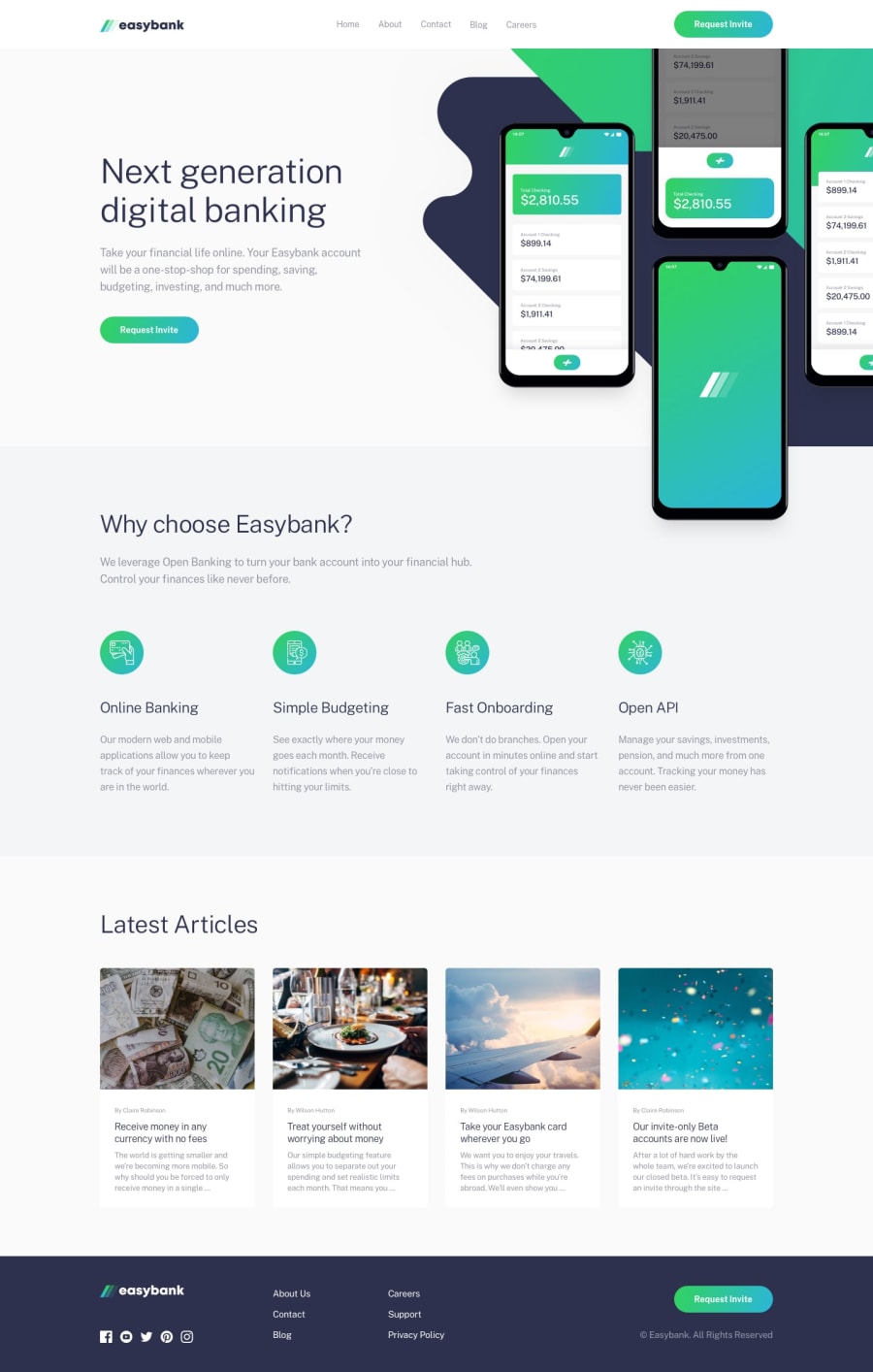
Easybank landing page using HTML and CSS
@SatyapriyaMahato
Design comparison
SolutionDesign
Solution retrospective
Simple and fun project using pure Html and CSS. I faced a little difficulty while making the menu bar but at the end it was. I used a checkbox input to toggle the menu bar. Feel free to suggest any improvements.
Community feedback
- @juarezv90Posted over 1 year ago
- Your Burger SVG effect is excellent, and functions great
- Your mobile menu though has an out of place margin that does not allow clean line up with the navbar.
- Your container does not wrap the whole project evenly so the page display unportionately to design challenge.
- Padding not even which causes a lot of elements to be out of place.
- Opportunity lies for use of
display:flex;design options
Excellent use of semantic html elements
Bonus Points: utilizing comments in your html
Please check out mine and let me know where I can improve as well
0
Please log in to post a comment
Log in with GitHubJoin our Discord community
Join thousands of Frontend Mentor community members taking the challenges, sharing resources, helping each other, and chatting about all things front-end!
Join our Discord
