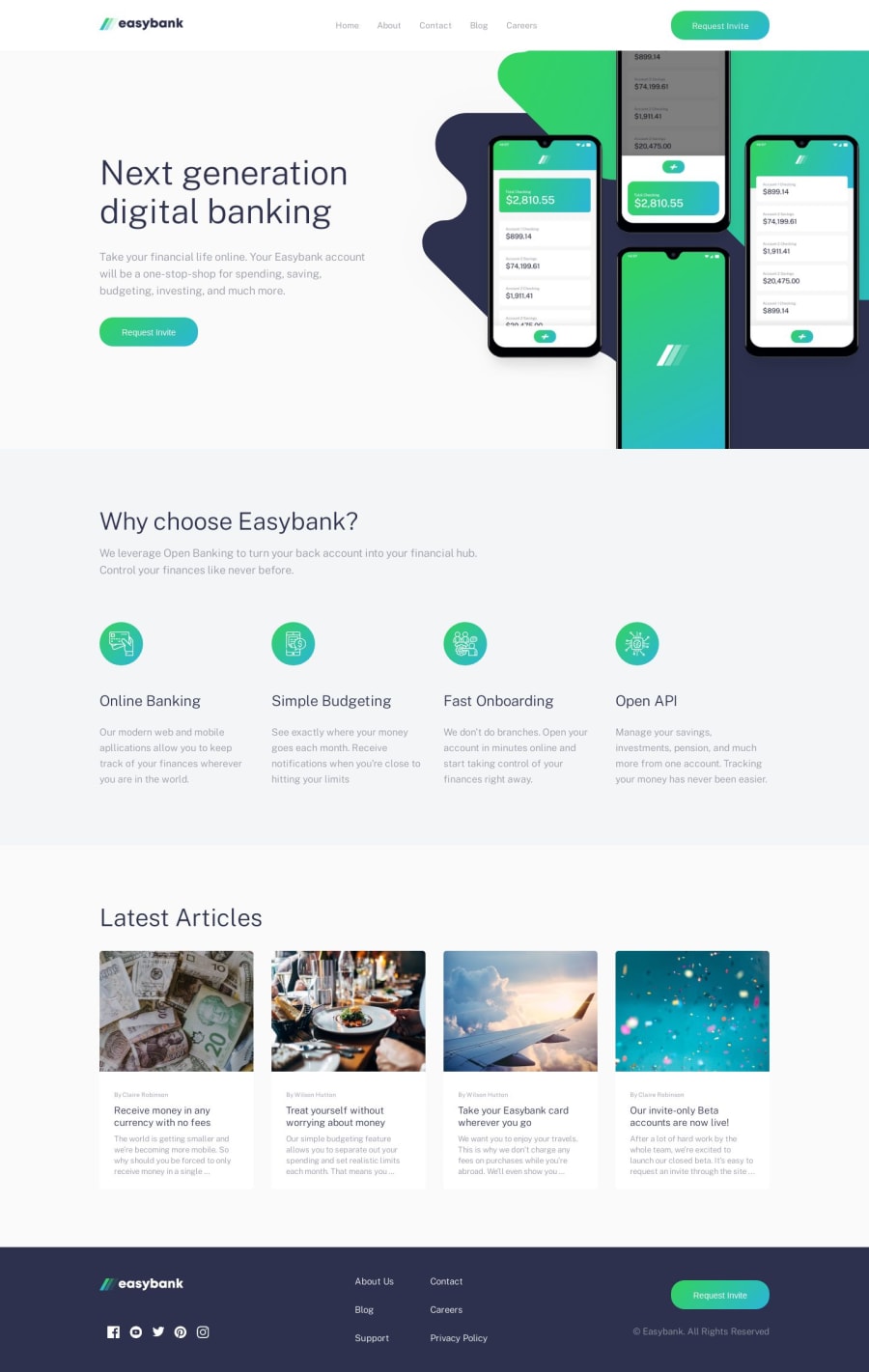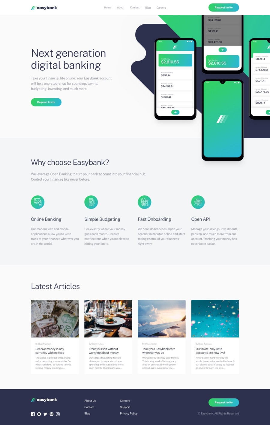
Design comparison
SolutionDesign
Community feedback
- @shashiloPosted over 4 years ago
Great job Ana! The desktop and mobile implementations are very good. I know this challenge doesn't call out tablet, but it would be good to focus on that for the next project. Your eye for detail is very good. Many people miss the subtle details for this challenge, but you did a great job!
Here's a list of improvements for next time:
- The man nav border should be a pseudo element with a gradient background. As a border, you cannot make this into a gradient.
- I'd add a subtle CSS
transition:to your links and buttons. Giving it some nice smooth animation. - Request invite should be a link.
- Footer links are mis aligned. They should be flushed to the left next instead of centered.
- Mobile // Between your sections, looks like you're still using the desktop padding. There should be less space between sections.
- Mobile // looks like you didn't implement the mobile menu.
0
Please log in to post a comment
Log in with GitHubJoin our Discord community
Join thousands of Frontend Mentor community members taking the challenges, sharing resources, helping each other, and chatting about all things front-end!
Join our Discord
