


Design comparison
SolutionDesign
Solution retrospective
What are you most proud of, and what would you do differently next time?
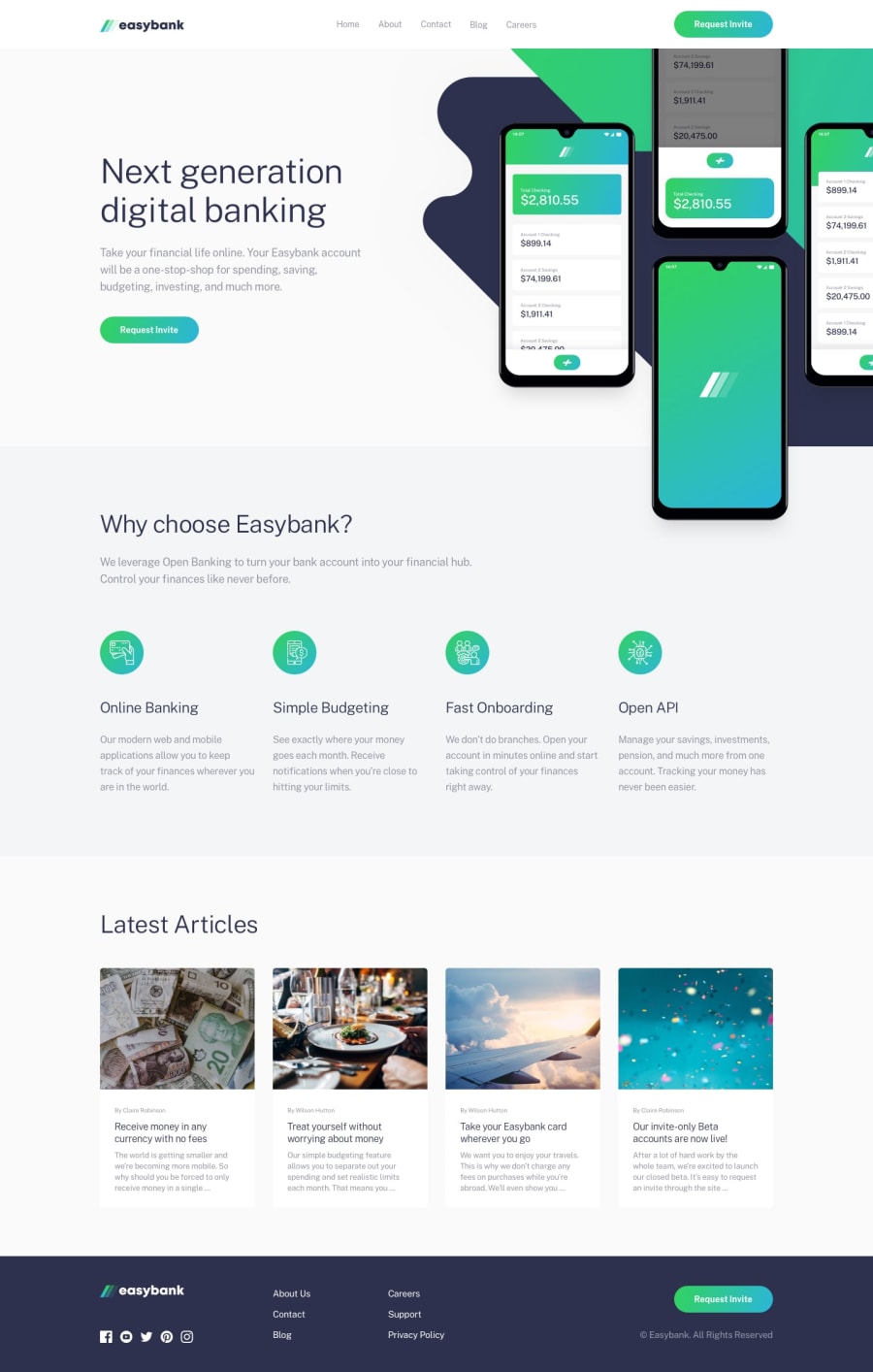
Im proud that i was able to position the image in such a way that part of it was outside the grid, though it was not perfect. I hope to keep refining my grid layout skills.
What challenges did you encounter, and how did you overcome them?I encountered horizontal scrolling when I was positioning the image to dip out of the grid slightly. but I was able to solve it by setting overflow-x: hidden on the container of the image.
All suggestions on better ways to implement the dipping out of the image are welcome.
Community feedback
Please log in to post a comment
Log in with GitHubJoin our Discord community
Join thousands of Frontend Mentor community members taking the challenges, sharing resources, helping each other, and chatting about all things front-end!
Join our Discord