Submitted almost 2 years ago
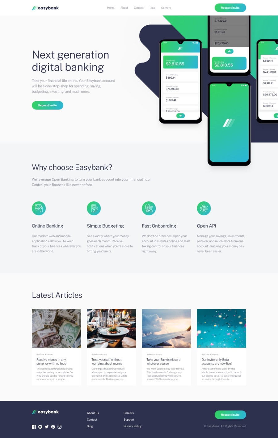
Easybank landing page using Flexbox and CSS Grid / mobile-first.
@bengera
Design comparison
SolutionDesign
Solution retrospective
Overview: This is the first time I made a website using @use and @forward rules instead of @import. The biggest challenge was making the mobile background image and background pattern scale smoothly while staying close to the top navigation bar. The final result looks fine on desktop and mobile devices, but may need some optimization for tablet screens and very large screens.
Things that could be improved / worked on:
- Tablet screen optimization.
- Fading effects on the button elements. I wasn’t able to figure out how to apply a transition from one background linear gradient to another. For example, from
background: linear-gradient(135deg, #33D35E 0%, #2AB6D9 99.58%);tobackground: linear-gradient(135deg, rgba(51, 211, 94, 0.4), rgba(42, 182, 217, 0.4));I couldn’t apply any transitional effects to buttons with these gradients. - Alignment between sections on very large screens.
Questions:
- Is it possible to apply transitions to elements that have background gradients?
- Hovering over the 3 CTA buttons ‘Request invite’ appear to cause some sort of slight shift in the surrounding layout, what might be causing this?
Any sort of feedback would be greatly appreciated!
Community feedback
Please log in to post a comment
Log in with GitHubJoin our Discord community
Join thousands of Frontend Mentor community members taking the challenges, sharing resources, helping each other, and chatting about all things front-end!
Join our Discord
