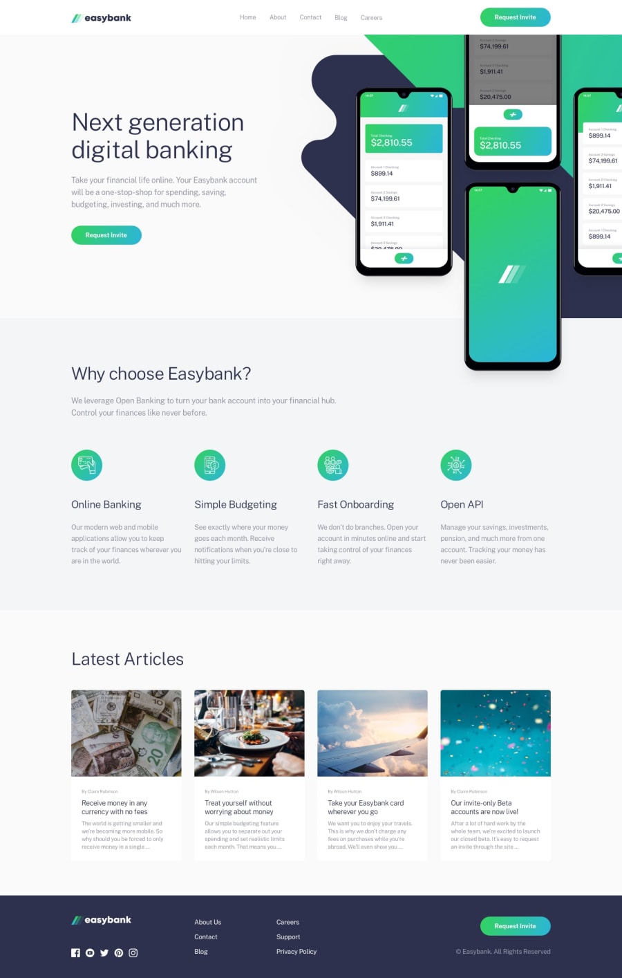
Design comparison
Solution retrospective
Share your thoughts....
Community feedback
- @simonhernandezPosted over 2 years ago
Hello, Ponnuasamy! 👋
Great work on this solution! I really like that it is responsive, and the fact you added a cool transition on the mobile menu.
Looking into your code I thought of some suggestions you might find helpful:
-
On the Articles Section I noticed you gave a class to each of the individual articles (articles1, articles2, and so on) with the same styles. I think it would be more efficient to create a single
.articleclass containing those styles and applying it to each article element, that way you get rid of redundant CSS. Same with the.navtextclasses. -
I would consider setting a max-width on the Article elements, so that they do not stretch all the way on tablet screen size. Same with the Feature elements.
Hope you find this feedback helpful!
Marked as helpful1 -
Please log in to post a comment
Log in with GitHubJoin our Discord community
Join thousands of Frontend Mentor community members taking the challenges, sharing resources, helping each other, and chatting about all things front-end!
Join our Discord
