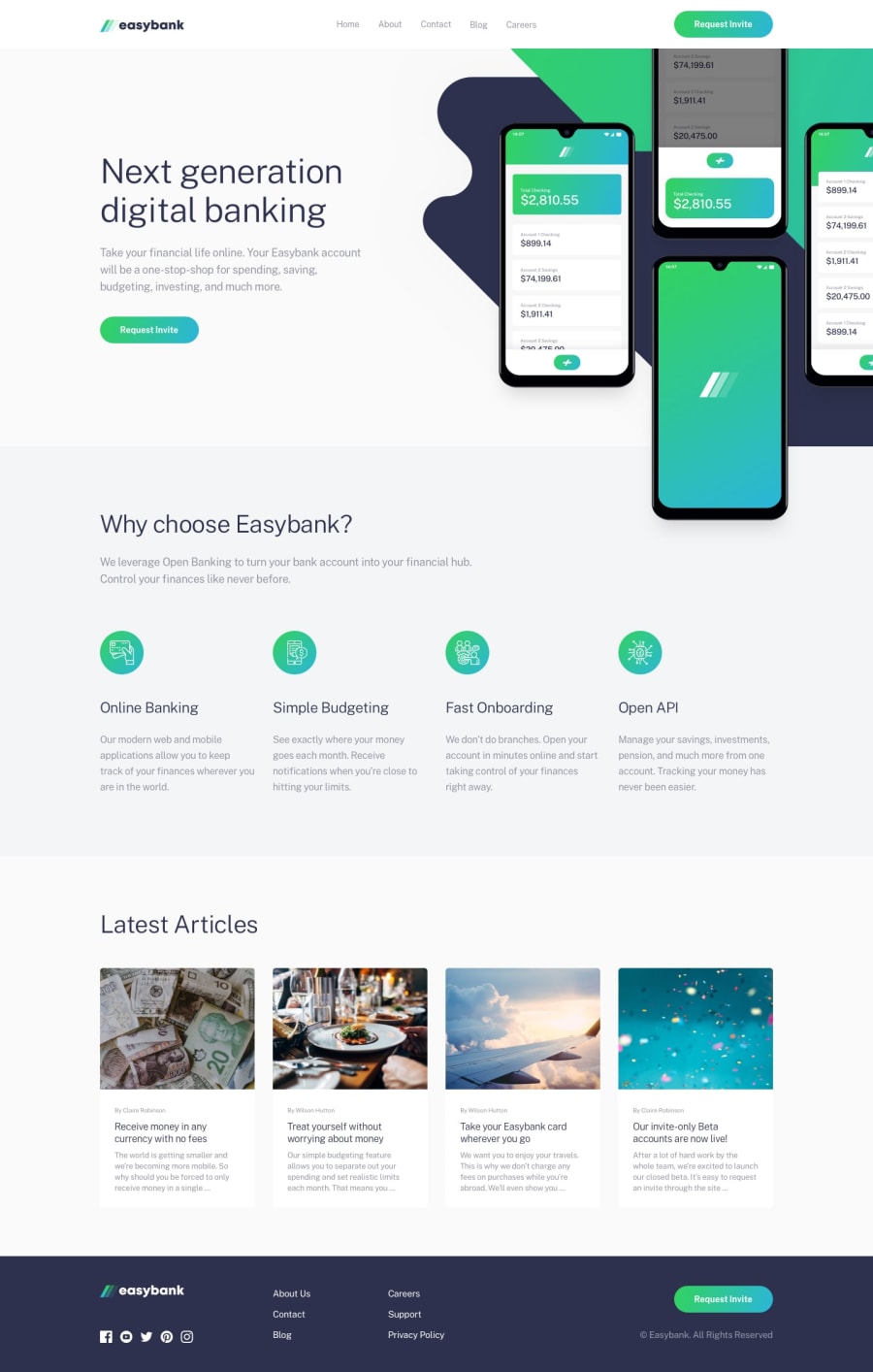
Responsive easybank landing page using SASS&BEM
Design comparison
Solution retrospective
This was my first intermediate challenge and I'm so proud of myself that I made it! Any feedback is welcome! :)
Community feedback
- @ApplePieGiraffePosted almost 2 years ago
Hi, katrine9176! 👋
Nice work on this challenge! 🙌 Your solution looks good and is responsive! 👍
Just a few small tips for you! 🙂
You don't need to add
aria-hidden="true"to images if you leave theiraltattribute empty (since that will already cause screen readers to ignore those images).To make your HTML a little more semantic, you can use
ulandlielements to wrap the list of features in the "Why choose Easybank?" section (you can do the same thing for the list of links in the footer of the page). 😉It would be worth adding some
aria-labels to the social media links in the footer of the page since they don't have any text inside to identify them.And lastly, try to use only one
h1tag per page. This is a good practice since there should be only one most important heading on a page. You can use less-important headings tags (such ash2andh3) for the rest of the headings on the page.Hope you find this helpful. 😊
Keep coding (and happy coding, too)! 😁
Marked as helpful0@katrine9176Posted almost 2 years ago@ApplePieGiraffe really really thank you for your feedback! Btw, I added two h1 tags by accident and I've just fixed it.
1
Please log in to post a comment
Log in with GitHubJoin our Discord community
Join thousands of Frontend Mentor community members taking the challenges, sharing resources, helping each other, and chatting about all things front-end!
Join our Discord
