Design comparison
SolutionDesign
Solution retrospective
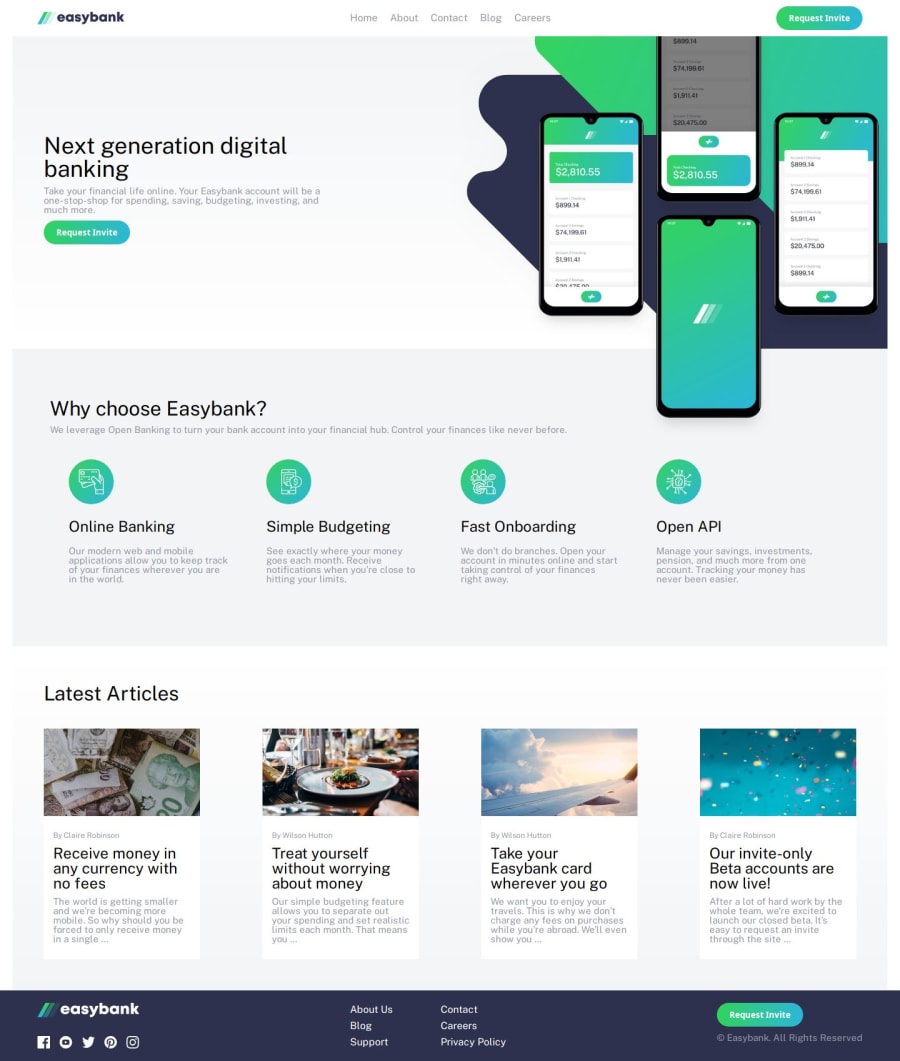
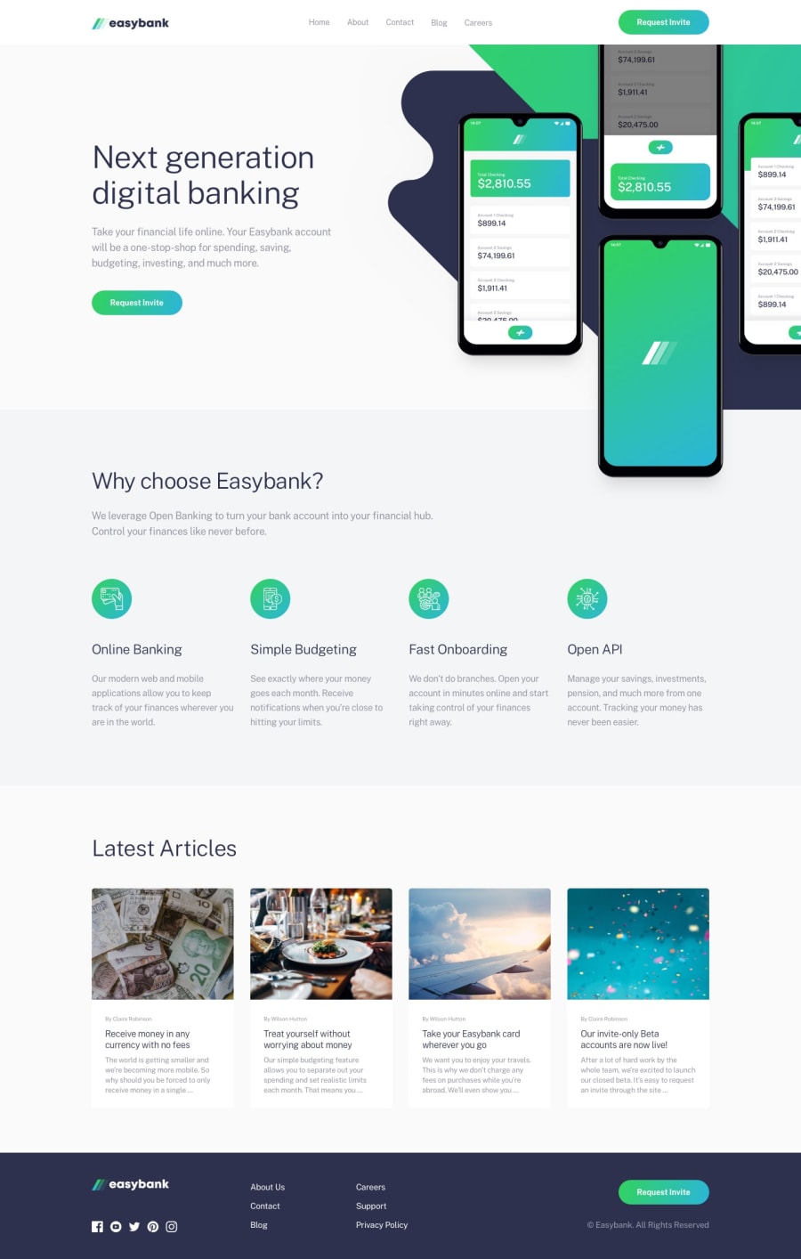
This definitely helped to boost my confidence with layouts. The main issue I had was with the image in the back of the hero, especially on longer page sizes. I ended up just making there be a max width, but it does look a little strange when there's white space to the right of the image. Do you have any suggestions for how to approach designs like this, especially at larger dimensions?
Community feedback
Please log in to post a comment
Log in with GitHubJoin our Discord community
Join thousands of Frontend Mentor community members taking the challenges, sharing resources, helping each other, and chatting about all things front-end!
Join our Discord
