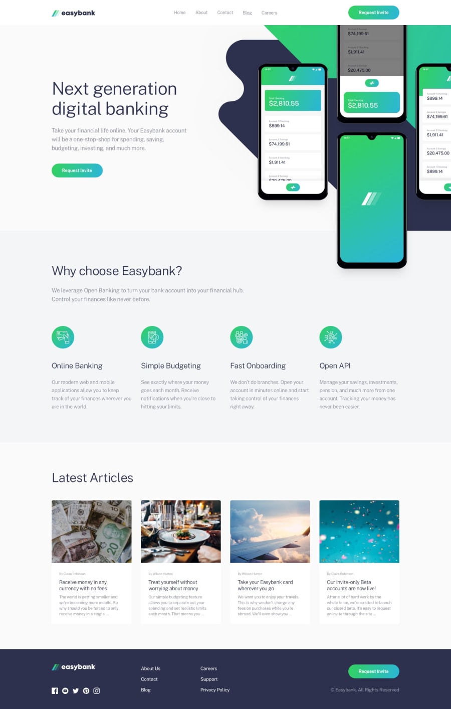
Design comparison
SolutionDesign
Solution retrospective
Feedback welcome! 😃
Community feedback
- @ApplePieGiraffePosted almost 2 years ago
Hey there, Marko! 👋
Nice work on this challenge! 👍 Your solution looks great and is responsive (and your markup looks good, too)! 👏
One very small suggestion I have is to perhaps switch to a mobile-friendly layout for the article cards in the "Latest articles" section a bit later, or at least give them a max-width, since they are a bit huge when the layout first changes from desktop to mobile. 😅
Keep coding (and happy coding, too)! 😁
0
Please log in to post a comment
Log in with GitHubJoin our Discord community
Join thousands of Frontend Mentor community members taking the challenges, sharing resources, helping each other, and chatting about all things front-end!
Join our Discord
