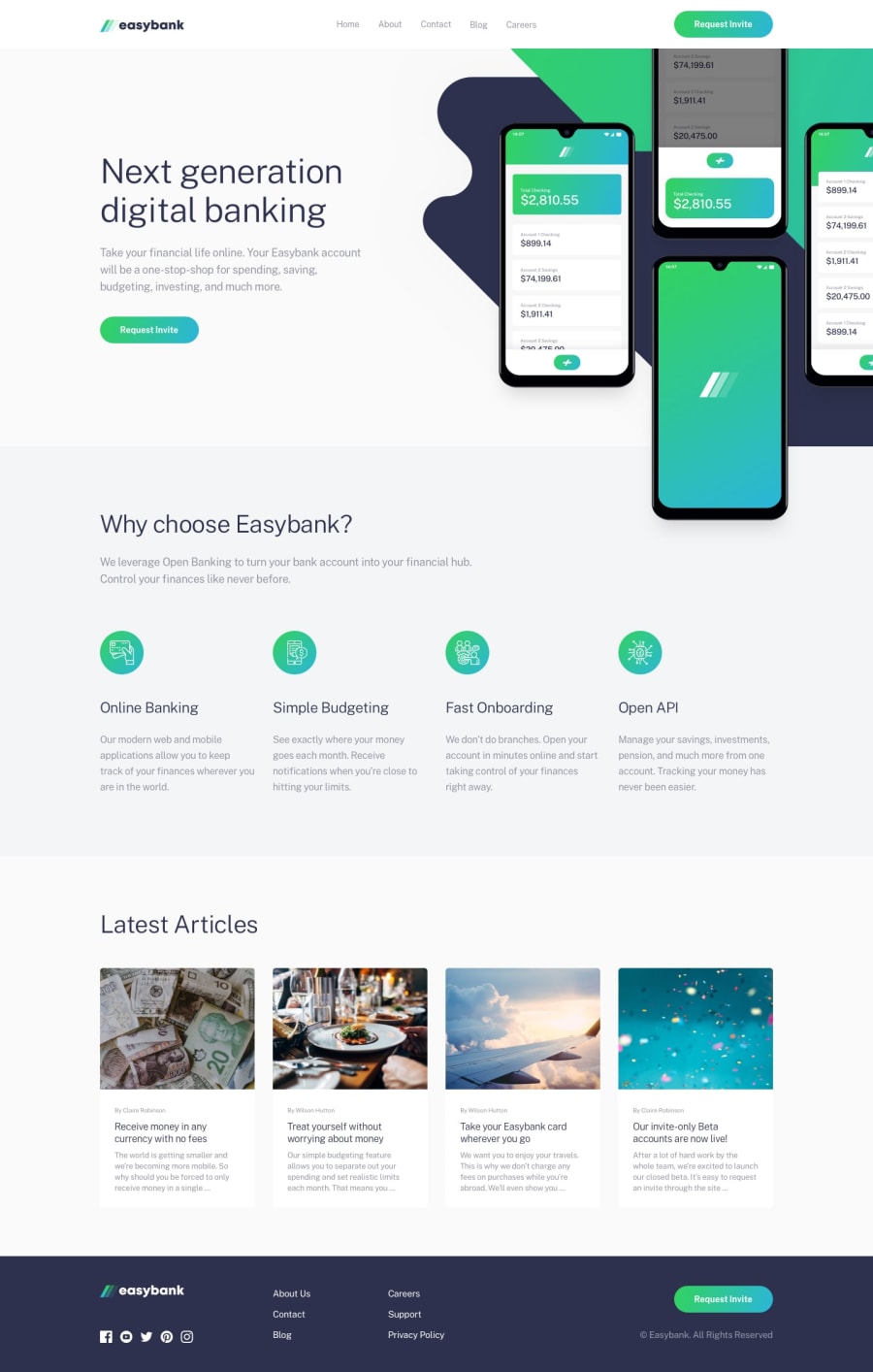
Easybank landing page solution with React, TypeScript and TailwindCSS
Design comparison
Solution retrospective
How this project was structured. I can clearly see what compenent belong to what section in the page.
What challenges did you encounter, and how did you overcome them?Mainly the hero section of the page. I looked up other people's solution and found that you can use pseudo elements to put in images, then adjust the position and sizing until it looks like the design.
Another thing was the mobile navigation menu. This was also other people's solution. Basically, you established 2 parts of the menu: the overlay, and the menu. Fixed the overlay on the web page and adjust the top position to the height of the navigation bar. For the menu, you centered it by calculating full width minus space you need, translate X by -50%, then position it left by 50%
Community feedback
Please log in to post a comment
Log in with GitHubJoin our Discord community
Join thousands of Frontend Mentor community members taking the challenges, sharing resources, helping each other, and chatting about all things front-end!
Join our Discord
