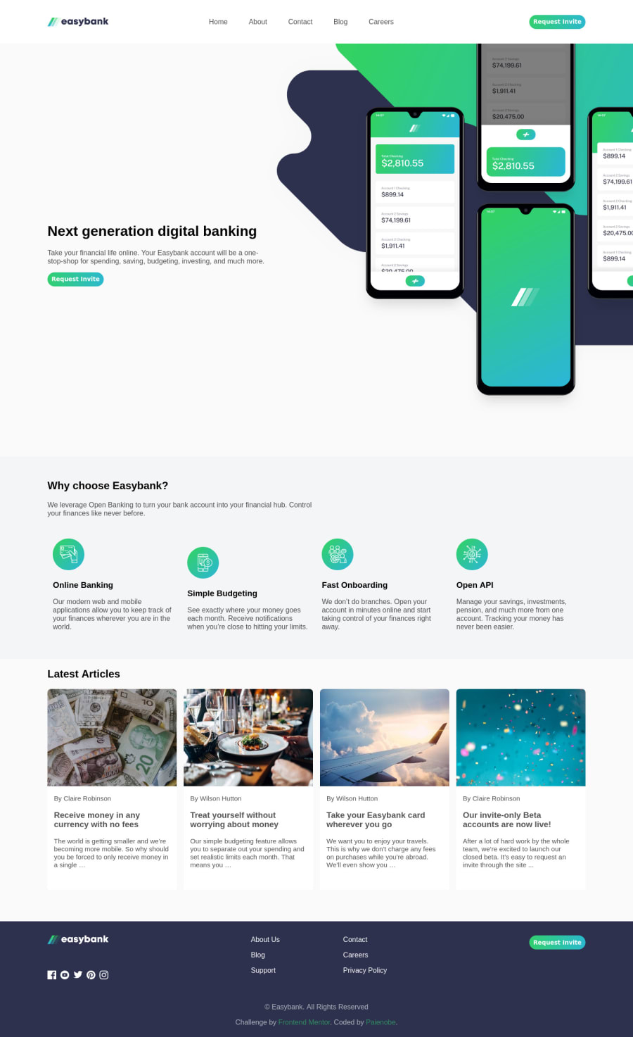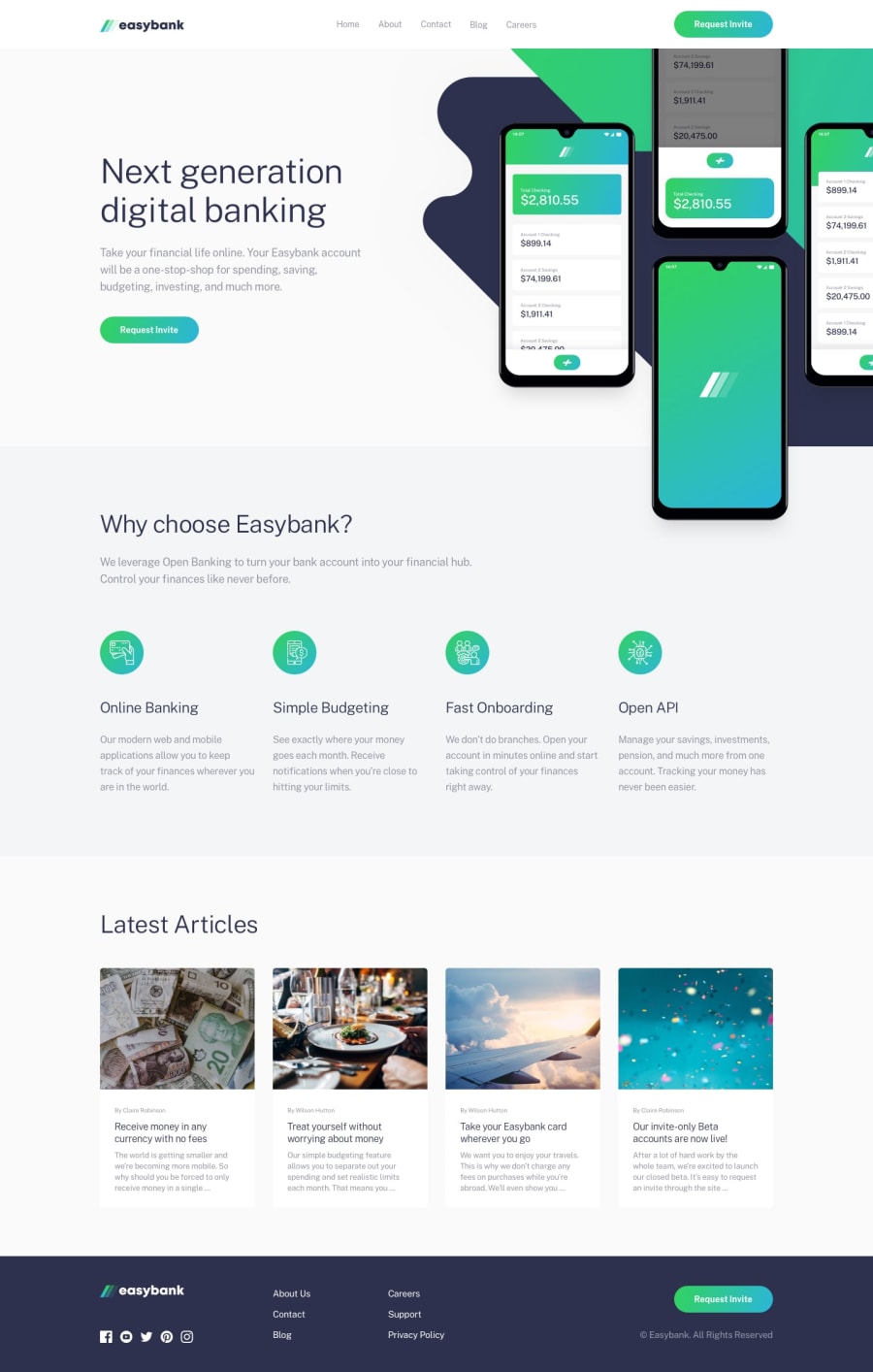
Design comparison
SolutionDesign
Solution retrospective
Feedback please
Community feedback
- @ChamuMutezvaPosted over 3 years ago
- use semantic html, the following code will not be picked up by screen readers. A button - an interactive element should have been used.
<div class="hamburger"> <span class="bar"></span> <span class="bar"></span> <span class="bar"></span> </div>- alt values are used by assistive tech users to visualize the message that is being put across from the image. Decorative images use
alt="". The following is too shallow or has no meaning<img src="./images/image-mockups.png" alt="intro-img" class="intro-img"> - well done on the designs
Marked as helpful1 - @Cooly-o-CatsPosted over 3 years ago
Nice! Seems like some of the styles are off. Check the design and try a little bit harder! Mainly some fonts and sizes are off.
Marked as helpful1
Please log in to post a comment
Log in with GitHubJoin our Discord community
Join thousands of Frontend Mentor community members taking the challenges, sharing resources, helping each other, and chatting about all things front-end!
Join our Discord
