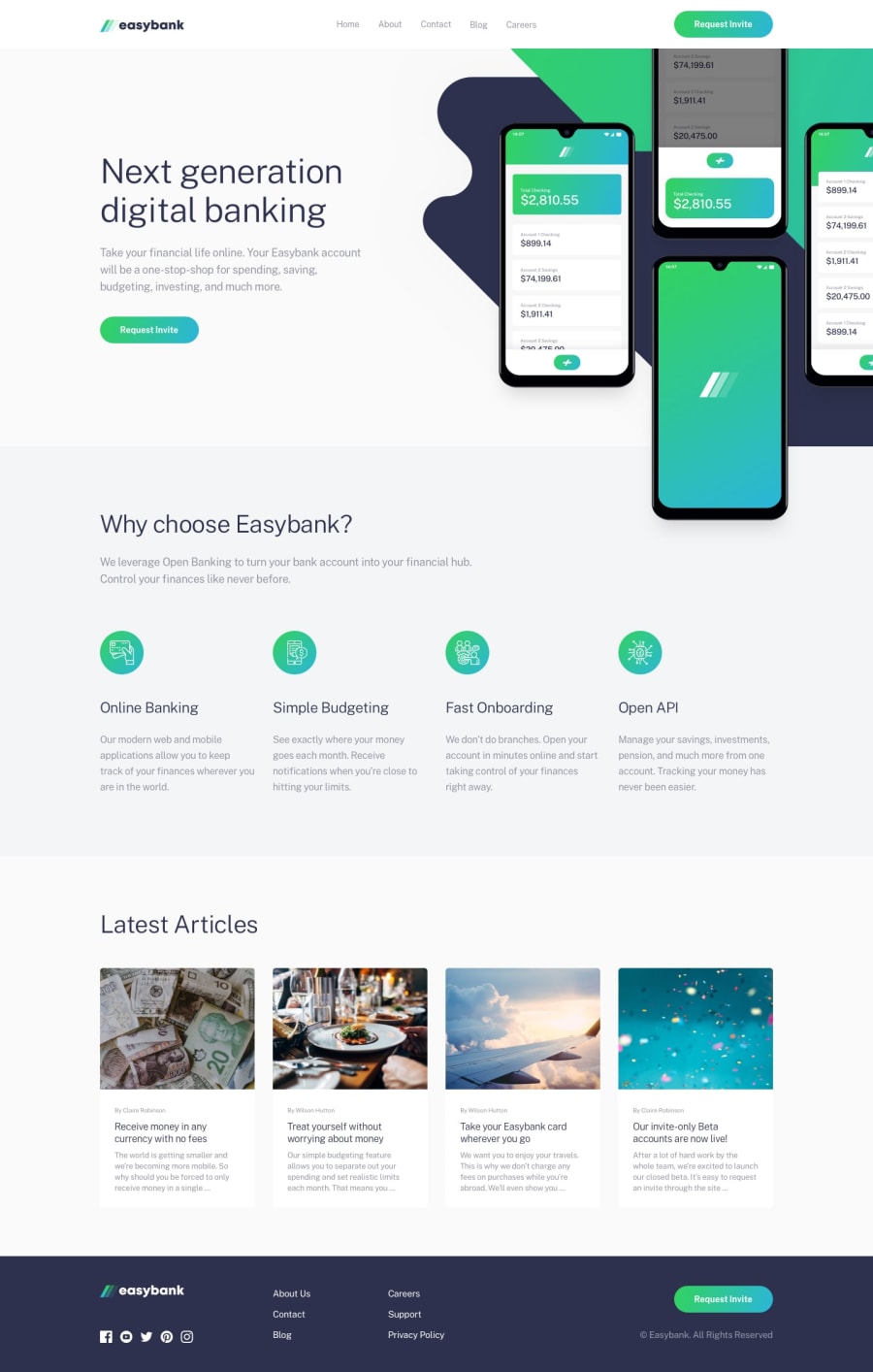
Design comparison
SolutionDesign
Solution retrospective
This was a fun one but I had a hard time making the intro background & intro image responsive. It looks great in mobile and desktop view. However, I struggled with tablet view. Any feedback is welcome and highly appreciated!😊
Community feedback
- @ApplePieGiraffePosted almost 4 years ago
Hey, there, Itai! 👋
Nice to see you complete another challenge! Good job on this one! 👏
Your solution looks good and responds rather well! 👍
I suggest,
- Making sure the hero image doesn't cover up the text below then when the width of the screen grows larger.
- Perhaps adding a max-width to some of the containers or content wrappers on the page to prevent the layout from looking a little stretched on extra-large screens.
- Looks like you might have a duplicate ID on your page (according to your solution report). You might want to fix that real quick!
Keep coding (and happy coding, too)! 😁
0
Please log in to post a comment
Log in with GitHubJoin our Discord community
Join thousands of Frontend Mentor community members taking the challenges, sharing resources, helping each other, and chatting about all things front-end!
Join our Discord
