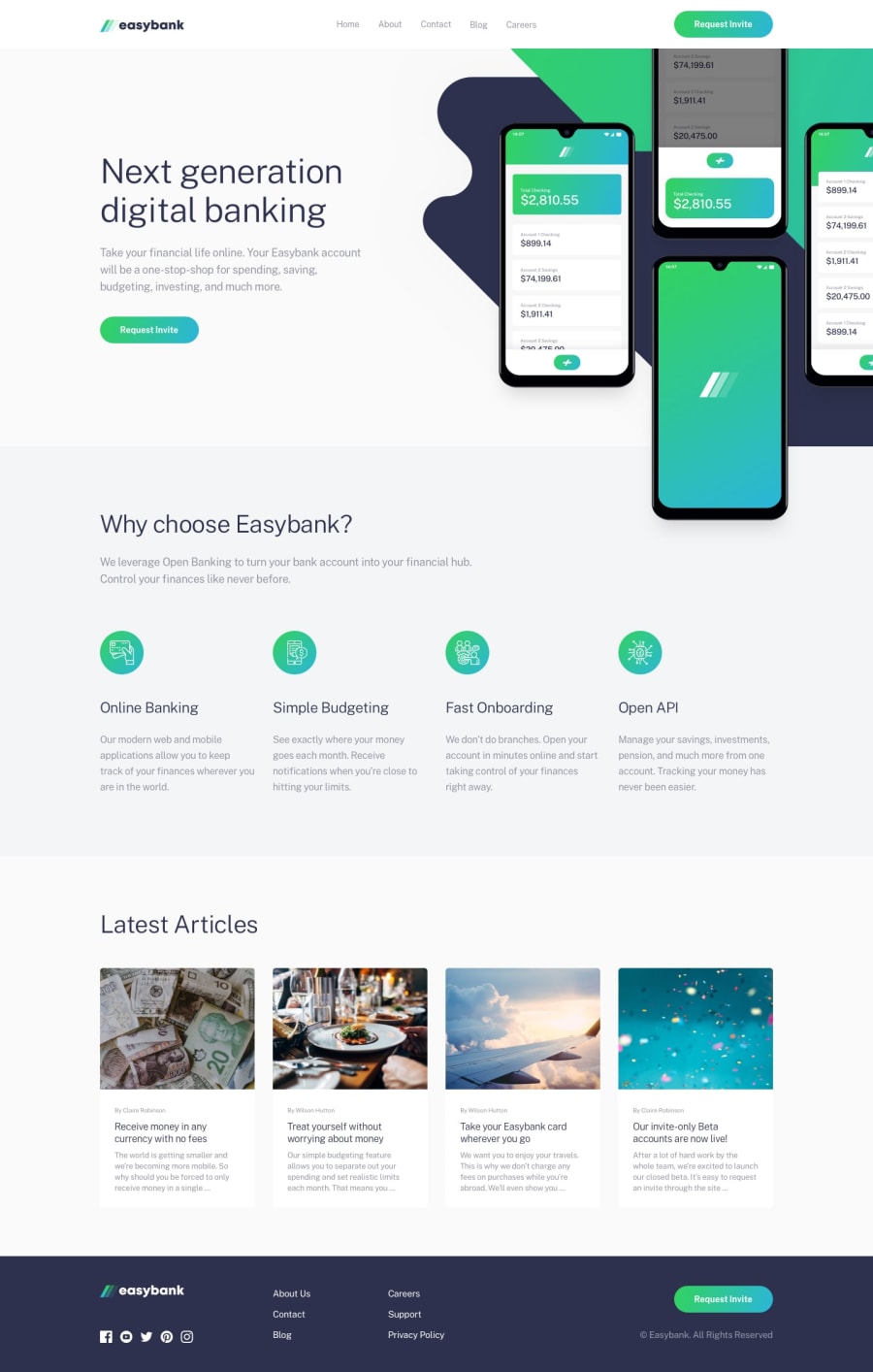
Easybank landing page - responsive - using HTML and CSS
Design comparison
Solution retrospective
Well, this was pretty annoying layout to style
Community feedback
- @JunayedJihadPosted over 1 year ago
Why it was annoying? By the way,You have done almost perfect.
1@giorgi-2001Posted over 1 year ago@JunayedJihad thanks for the feedback! Well, first I had problems with latest articles' images. had to give the cards and images within them fixed height to make them look even. Banner images were difficult to position correctly. Then I had problems with overflowing image and I tried to fix it by giving the body "overflow-x: hidden" property. Soon realized that my header lost the properties of sticky position. It appears that if parent element has the property of overflow, child element stops acting like a sticky element...
0@JunayedJihadPosted over 1 year ago@giorgi-2001 oh,I see.Keep it up,You will do just fine
1
Please log in to post a comment
Log in with GitHubJoin our Discord community
Join thousands of Frontend Mentor community members taking the challenges, sharing resources, helping each other, and chatting about all things front-end!
Join our Discord
