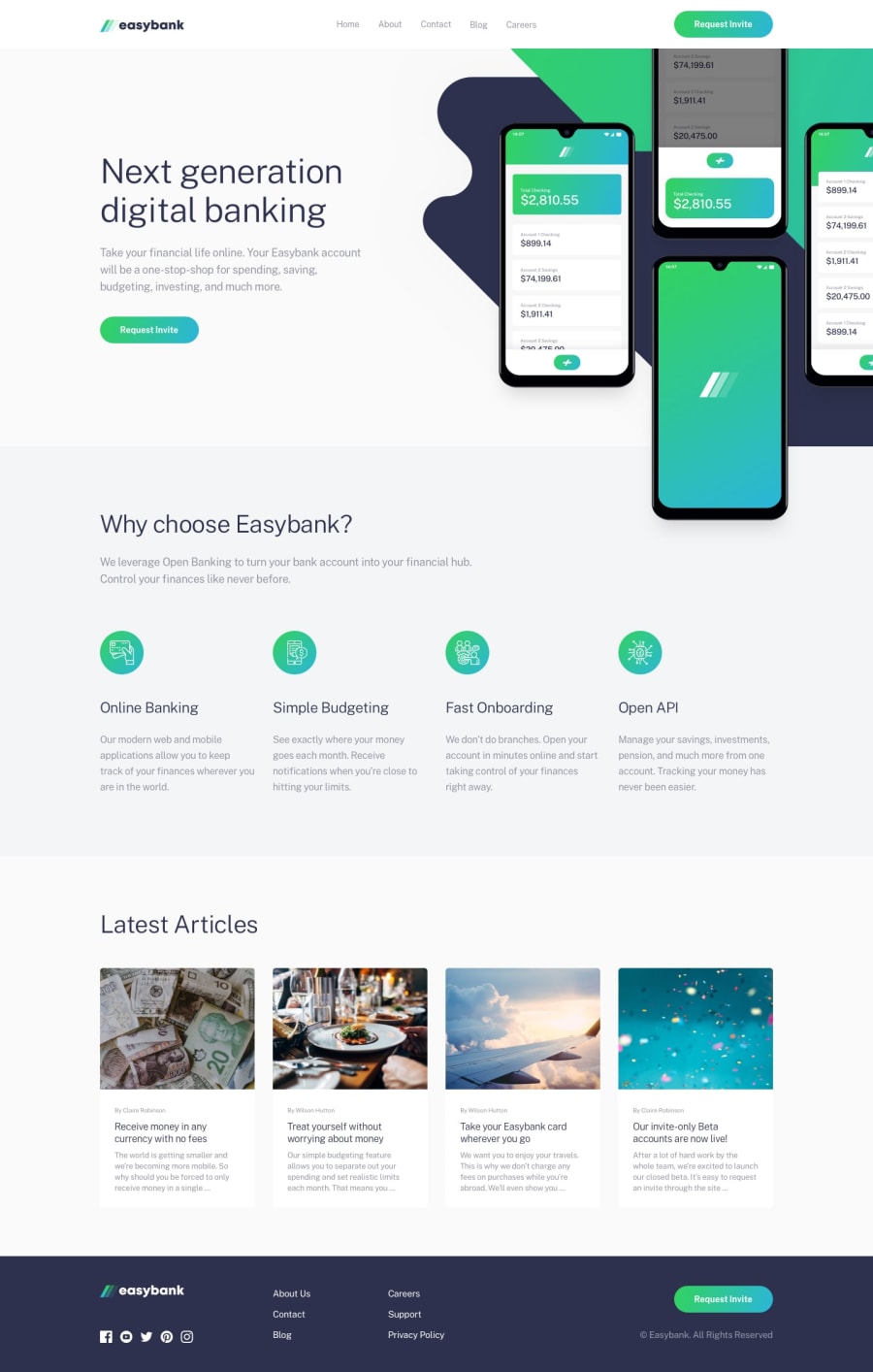
Design comparison
Community feedback
- @calebmcmainsPosted over 1 year ago
Hey Karam! Nice work. I can tell you spent a lot of time to make sure that things looked good at both the 1440 screen size and the 375 screen size. I noticed that there was't much time spent on the in between screen sizes reducing how responsive of a landing page it really is.
Something I'd say that could be an area of improvement would be the use of Flexbox and/or Grid. There are so wonderful CSS properties in those tools that make spacing and centering html element really easy. When I looked closer at your code you used a lot of margins, gaps and padding to make it look visually correct but in the end was probably tedious to do and doesn't help with the need for responsiveness.
Hope this is helpful as you continue to grow as a frontend developer!
Marked as helpful0@karam-7Posted 10 months ago@calebmcmains thank for your advice and sorry for late reply. I'm new in this field so i do so many mistakes and thanks again
0
Please log in to post a comment
Log in with GitHubJoin our Discord community
Join thousands of Frontend Mentor community members taking the challenges, sharing resources, helping each other, and chatting about all things front-end!
Join our Discord
