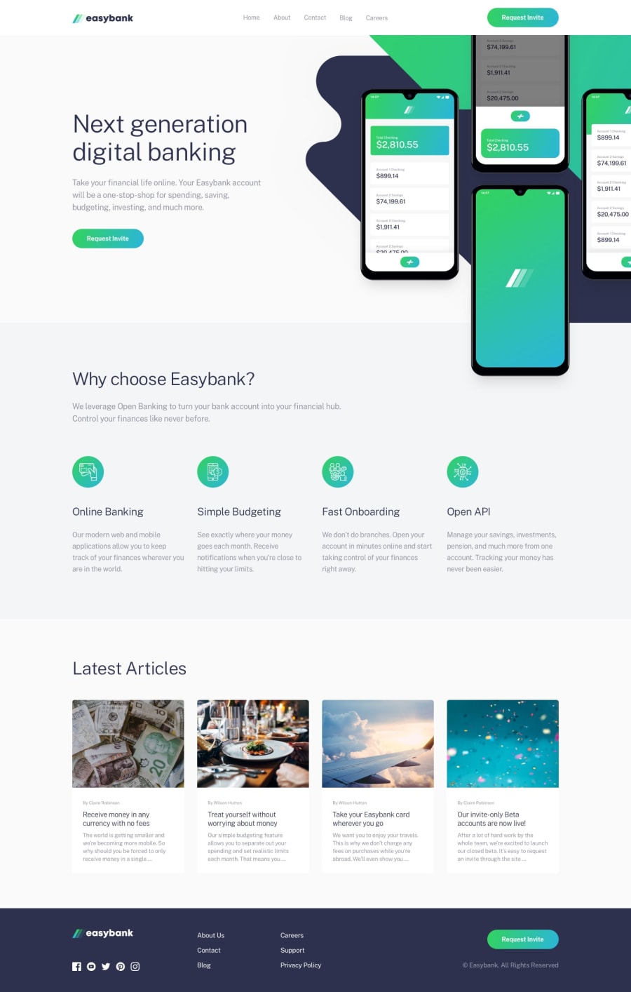
Design comparison
Solution retrospective
I am just a beginner and would appreciate any feedback.
Do I have good practices? What errors do I have? How could I improve my code?
Thanks <3
Community feedback
- @ApplePieGiraffePosted over 3 years ago
Hey, great job on this challenge, MasterKrab! 👍
As usual, your solution looks great and everything responds well! 🙌 I especially like the hover states of the navigation links in the header of the page and of the mobile menu toggle! 😀
The only super minor thing I suggest is to perhaps add the active states of the titles of the article cards when the entire card is hovered over (not just the title itself) to make it extra clear that that card is hovered over and clickable. 😉
As always, keep coding (and happy coding, too)! 😁
1
Please log in to post a comment
Log in with GitHubJoin our Discord community
Join thousands of Frontend Mentor community members taking the challenges, sharing resources, helping each other, and chatting about all things front-end!
Join our Discord
