Design comparison
Solution retrospective
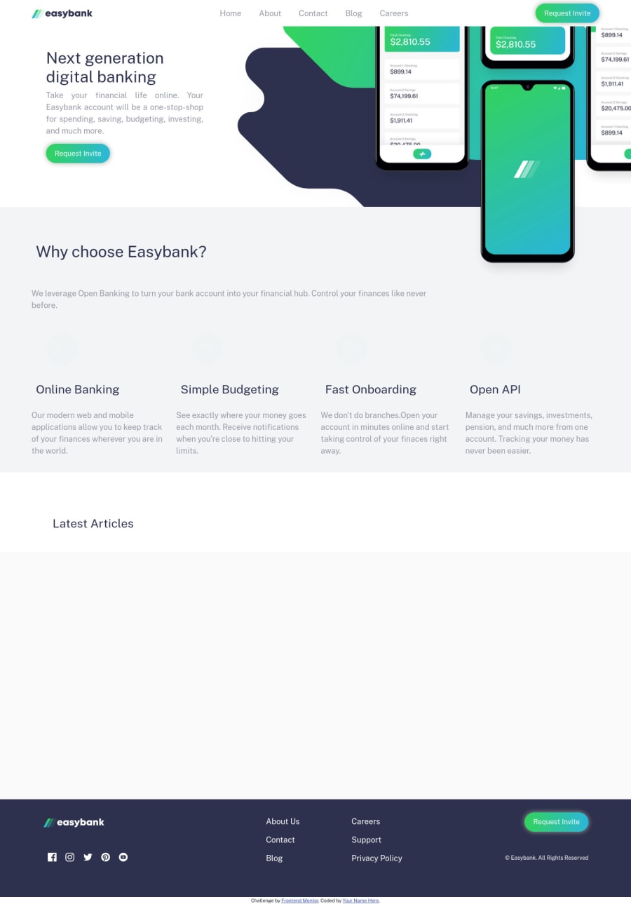
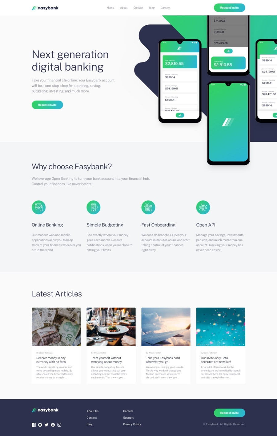
Please find hereunder my submission for Easybank Landing Page. I had a big problem with the positioning of the hero image and mobile phone image and make both of them responsive. Any comments and correction will be appreciated. Thank you
Community feedback
- @Comet466Posted over 3 years ago
good work on this challenge alexey looks sweet, i like the touch that the animation give to the layout, i see there's an image that is different from the rest you can fixed it by just declaring a "max-height" in the ".card-img-top" class, in this way you make 100% sure that all the image's are always in the right place, the hover elements of the social media looks kind of off too, you could fixed by just declaring the hover directly on the image, anyways good job and happy coding
0@alexeykuz-sysPosted over 3 years agoLuis, thank you! It is great advice, which helped me to fix the issues!
1
Please log in to post a comment
Log in with GitHubJoin our Discord community
Join thousands of Frontend Mentor community members taking the challenges, sharing resources, helping each other, and chatting about all things front-end!
Join our Discord
