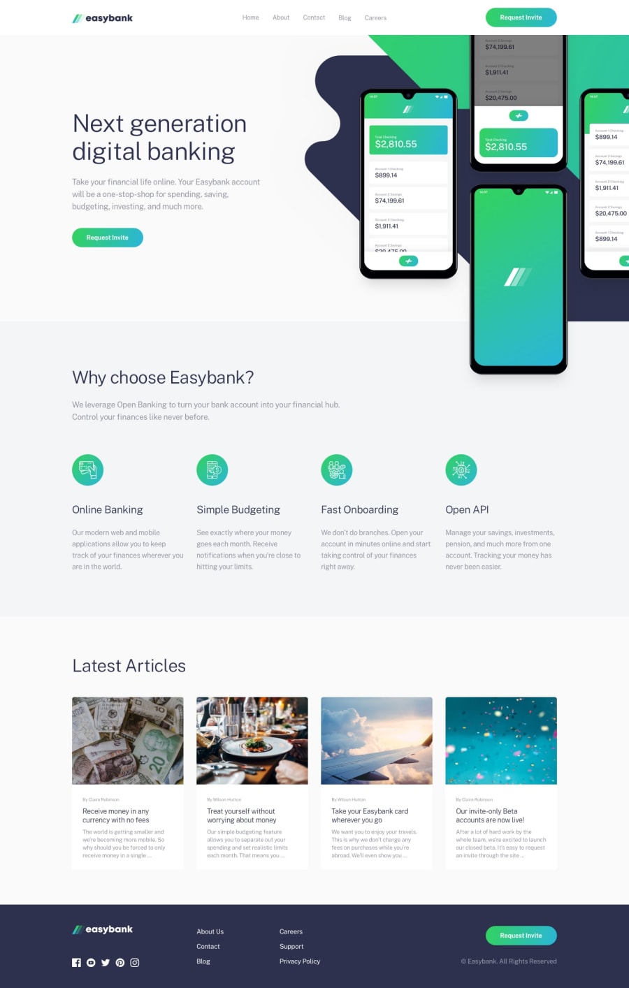
Design comparison
SolutionDesign
Solution retrospective
Hey Guys, I just finished the Easybank Landing Page Challenge. I would like you all to see it and let me know how I can improve it. Let me know my mistakes. Thank you!.
Community feedback
- @optimusprime202Posted almost 3 years ago
Hey @Krrish105, Wonderful work!
Marked as helpful0 - Account deleted
Hi there 👋
Congratulate on finishing your project 🎉. You did a great job 💡
I give some suggestions to help you take your project design to the next level 📈😉
- I think 4 card above the footer does not need box-shadow compared to the original design
Happy coding ☕
Maqsud
Marked as helpful0 - @EmmanuelHexerPosted almost 3 years ago
Great work overall.
- One problem is that, one of your section lacks header tag. To fix your html issues you should add a header tag like h2 - h6.
Marked as helpful0@karishma-devPosted almost 3 years agoOkay, I fixed that now. Thank you for your help!. :)
1 - Account deleted
Hi There,
- wrap all of the sections inside <main> tag to avoid accessibility issues and good job!
Marked as helpful0
Please log in to post a comment
Log in with GitHubJoin our Discord community
Join thousands of Frontend Mentor community members taking the challenges, sharing resources, helping each other, and chatting about all things front-end!
Join our Discord
