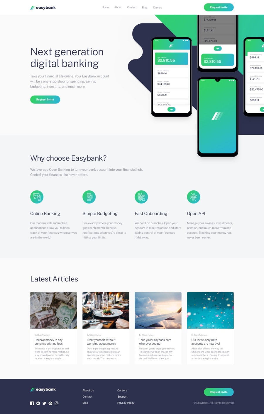
Easybank Landing page Mobile First Approach not so easy after all.
Design comparison
Solution retrospective
This is my 2nd challenge I've completed and I really wanted to test myself with a intermediate challange and I'm proud with what I came up with. I have to give credit where credit is do and Coder Coder help me with getting a idea on how to make the hero section responsive in this Coder Coder
If anyone has any advice on how I could improve the design or make it cleaner I would really appreciate it.
Community feedback
- @DylanGangatPosted over 3 years ago
Hey man.
Thanks for the advice I completely didn't see that my background's width was causing a overflow. I fixed it now tho. Thanks again.
0 - @ameyadeokulePosted over 3 years ago
The webpage looks perfect and like the way you have used animations on your mobile menu activation. The only pointer I can give you is that the webpage scrolls horizontally due to the large hero image, if you could change overflow to none it would be much better. Overall a very GOOD JOB indeed!!
0
Please log in to post a comment
Log in with GitHubJoin our Discord community
Join thousands of Frontend Mentor community members taking the challenges, sharing resources, helping each other, and chatting about all things front-end!
Join our Discord
