Submitted about 3 years agoA solution to the Digital bank landing page challenge
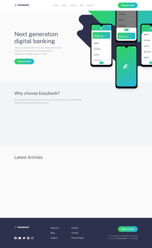
Easybank Landing Page Master's Solution | Responsive | Mobile-first
accessibility, semantic-ui
@Drougnov

Solution retrospective
Another intermediate challenge done.
This challenge was pretty fun and simple except for the header-img part. But after a few hours of headache, I managed to position it correctly. Would love some review on this.
Somethings that I added:
- Transitions on scroll/viewpoint.
- Animated preloader
- Animated hamburger
- Sticky navbar
Code
Loading...
Please log in to post a comment
Log in with GitHubCommunity feedback
No feedback yet. Be the first to give feedback on ROCKY BARUA's solution.
Join our Discord community
Join thousands of Frontend Mentor community members taking the challenges, sharing resources, helping each other, and chatting about all things front-end!
Join our Discord