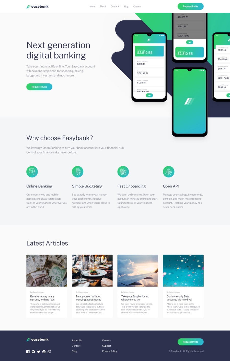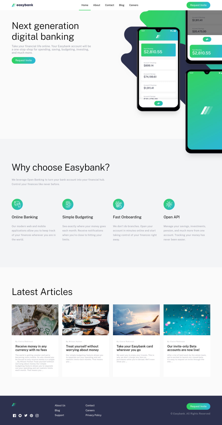
Design comparison
SolutionDesign
Solution retrospective
I did it without figma, so it looks a little diffrent from the picture also I'm lazy :D
Community feedback
- @iprinceroyyPosted over 2 years ago
That's excellent work @Wtyka2504. I would suggest some points here:
- You can use modern CSS features like clamp, min, and max for fluid typography, width, and padding. These are really helpful as the font size of some text/padding changes on different devices. If you look design-preview, you will observe it a different font size is being used for different viewports. Reference clamp
- For designing websites, there is semantic HTML markup that you should follow it. You can prefer my solutions it has zero issues.
- Footer logo is invisible, you can use the filter property on the logo to change its color. I've done it.
All others are perfect. I hope it adds to your learning. Happy coding :)
Marked as helpful1
Please log in to post a comment
Log in with GitHubJoin our Discord community
Join thousands of Frontend Mentor community members taking the challenges, sharing resources, helping each other, and chatting about all things front-end!
Join our Discord