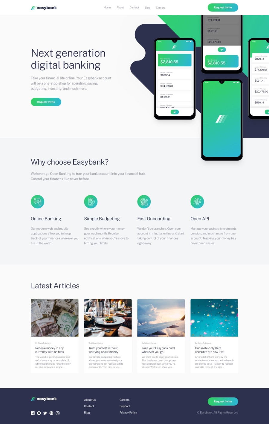
Design comparison
SolutionDesign
Solution retrospective
any feed back would be appreciated
Community feedback
- Account deleted
Hi, nice one on this challenge it looks pretty good, but there's some things that need to be fixed.
- The background shape that is on the first section is kind of everywhere. Once you start resizing it goes from the right to the opposite end.
- When you switch to desktop while the mobile menu is still active the shadow gets carried over.
None other than that It looks good, keep coding👍.
Marked as helpful0@M-KgobePosted about 3 years ago@thulanigamtee I did not take that into consideration when I was using the devTools. Thank you for the feedback.
0
Please log in to post a comment
Log in with GitHubJoin our Discord community
Join thousands of Frontend Mentor community members taking the challenges, sharing resources, helping each other, and chatting about all things front-end!
Join our Discord
