Design comparison
SolutionDesign
Solution retrospective
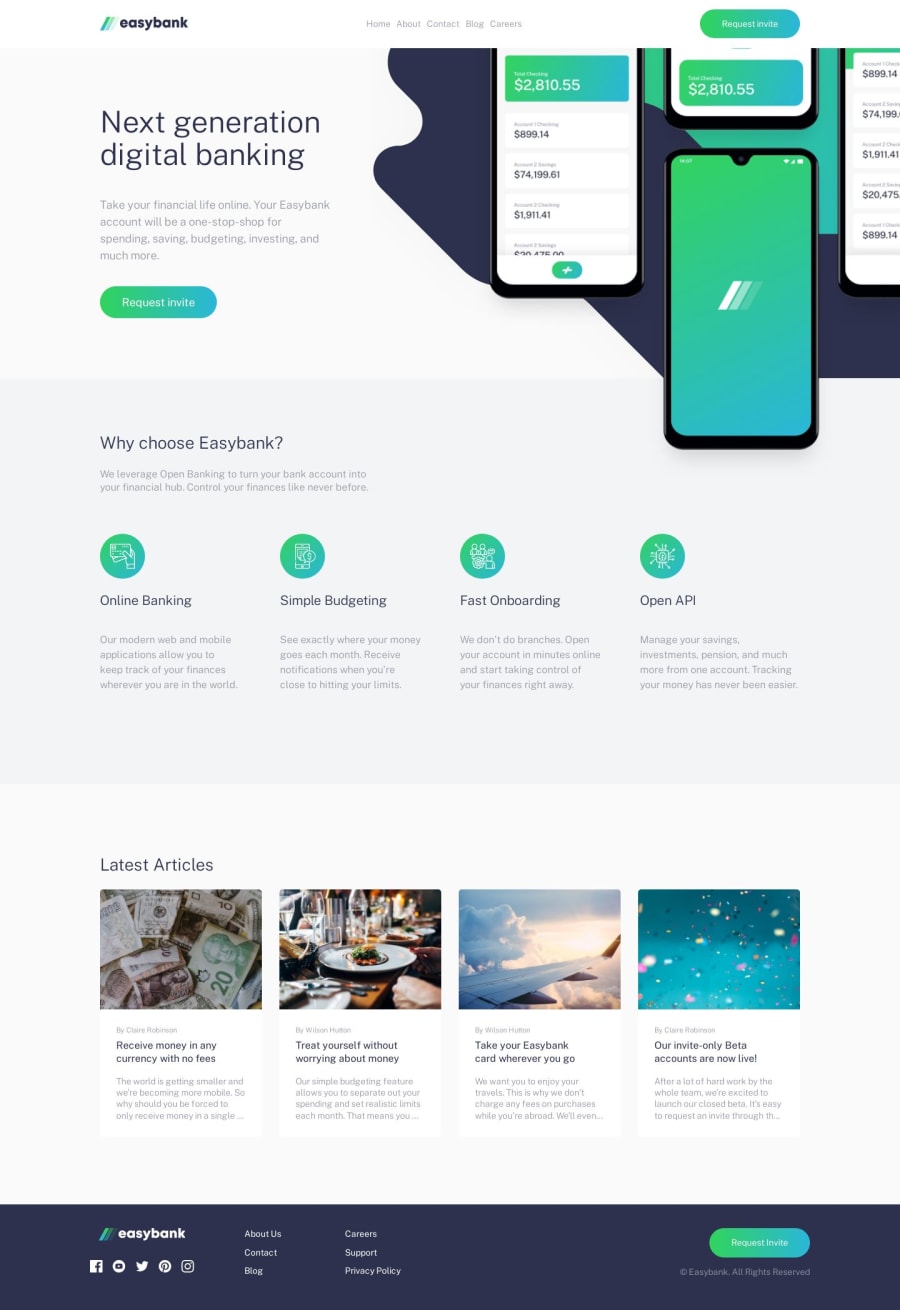
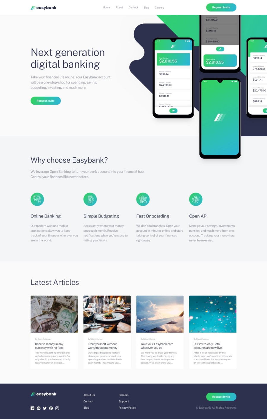
Hi, peeps <3 This little thing took me a whole week to complete(+ following the FreeCodeCamp video with @codercoder while trying to do by myself first). It really help me to exercise some flexbox that I almost completely forgot and start doing some SCSS. The moment I find myself completely lost was in the hero section with those background-images. Find a way to make them work together and replicate the image was really tricky. Ended up leaving it kinda of offplace compared to the image, but I think it's enough.
Community feedback
Please log in to post a comment
Log in with GitHubJoin our Discord community
Join thousands of Frontend Mentor community members taking the challenges, sharing resources, helping each other, and chatting about all things front-end!
Join our Discord
