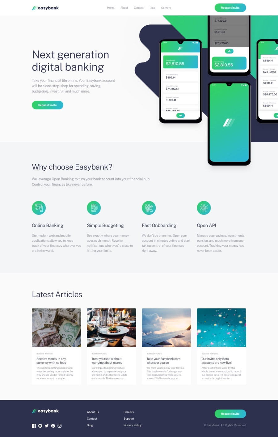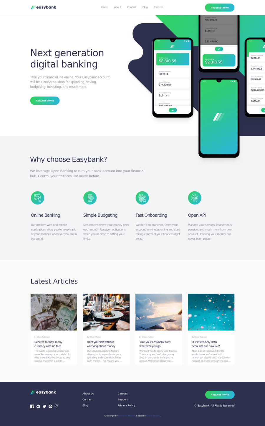
Design comparison
SolutionDesign
Solution retrospective
For this project, I used a display:flex on the html element in the CSS stylesheet, so that the site wouldn't break when stretching across multiple monitors for example. Feedback is welcome!
Community feedback
- @0xabdulPosted over 1 year ago
Hi
Felipe Thomé
| Dev | we'll congratulations on completing the Easybank landing page in this project is Awesome 👍 but one Accessibility reports occurred when? Landmarks ✅Solution 📌
IN HTML 📂 :
L A N D M A R K 🚀
- The main landmark should be a top-level landmark. When a page contains nested document and/or application roles (e.g. typically through the use of iframe and frame elements), each document or application role may have one main landmark. If a page includes more than one main landmark, each should have a unique label.
- To Clear the Accessibility reports use the Semantic elements Or non - Semantic elements
- Note This Elements are don't sikp
- semantic elements :
<aside> , <artical> , <main>, <header> ,<section><footer>, <form> ect..
- non- semantic elements :
<div> , <span> ect ...
- for easy way to clear the Accessibility reports using non semantic elements Ex :
<body> <div class="container" role="main"> // All html code goes here : 📃 </div> </body>
- Or
- using semantic elements
- Ex :
<header> should be put heading or logo📸 </header> <nav> //Links here </nav> <main> Main of the contents 📃 </main> <footer> ©copy right here📍 </footer>
I Hope it's useful comment for you and Happy Coding 😊
Marked as helpful1
Please log in to post a comment
Log in with GitHubJoin our Discord community
Join thousands of Frontend Mentor community members taking the challenges, sharing resources, helping each other, and chatting about all things front-end!
Join our Discord