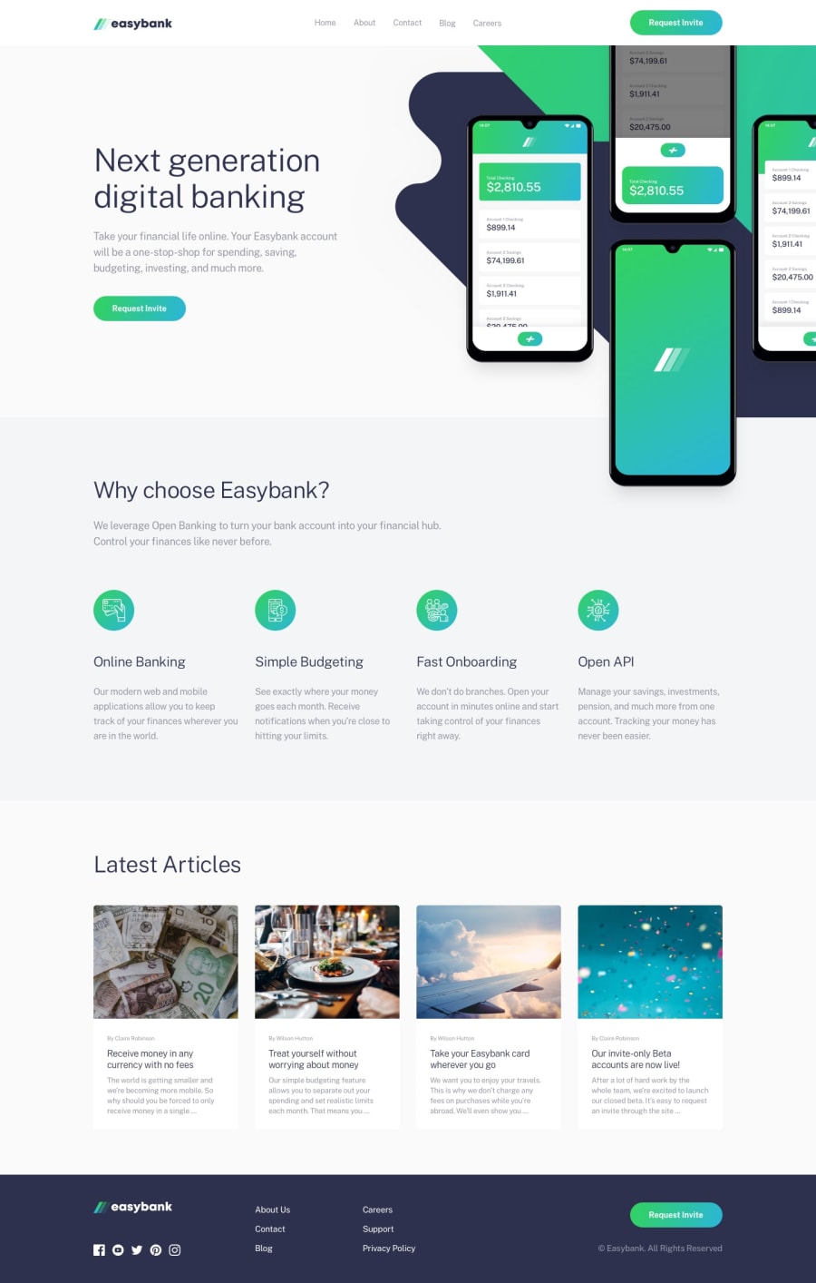
Design comparison
Solution retrospective
Hello! 💻👋 I would like to receive feedback on my project, to know how to improve. Thank you very much, greetings.
Community feedback
- @pikapikamartPosted about 3 years ago
Hey, awesome work on this one. Desktop layout looks great, it is responsive and mobile state looks great as well.
Some suggestions would be:
- The primary
navshould be inside aheader. That is why having this below markup would be really great:
<header />
<main />
<footer />
This way, all content of your page will be inside their own respective landmark element.
- Remember that a website-logo is one of the meaningful images on a site so use proper
altfor it. Use the website's name as the value likealt="easybank". - Those 4 icons could be hidden since they only act as decoration. Decorative images should be hidden for screen-reader at all times by using
alt=""andaria-hidden="true"to theimgtag or onlyaria-hidden="true"if the image is usingsvg. - You could use
articletag for each of the article-card since it makes sense. - For each of the article links, the
h3should be the one nesting theatag inside it and not the other way around.
FOOTER
- For the logo, since you are using
svgyou should add something like this on it to be readable by other screen-readers:
<svg role="img"> <title>easybank</title> .... </svg>- Each
atag that wraps the social-media icon should have eitheraria-labelattribute orsr-onlytext inside it, defining where the link would take them. For example, you should usefacebookas the value if the link would take the user to facebook. - Each of the social-media icon are decorative so use the method I mentioned above to hide them.
- Those 6 links should have been inside a
navelement since those are still your website's navigational links and also you should have used only 1ulsince they are all related. Usegridto place each item properly. - The
.attributioncould be placed inside thefooterso that it will be inside a landmark element.
MOBILE Hamburger menu should be using a
buttonsince it is an interactive component.SUPPOSING BUTTON IS USED
- The
buttonshould have a default attribute ofaria-expanded="false"and it will be set totruewhen the users toggles it and vice-versa. - The hamburger
buttonshould have eitheraria-labelattribute orsr-onlytext inside it which defines what thebuttondoes. You could usearia-label="navigation dropdown menu" - The
imginside the hamburger-menu should have been hidden since it is only a decorative image. - Lastly, the placement of the hamburger toggle and the dropdown is wrong. The dropdown should be placed after the toggle in the markup so that after toggling the button, the focus will be set next to the dropdown if navigated. Swap them up.
Aside from those, great job again on this one.
Marked as helpful1@AlarconJesusPosted about 3 years ago@pikamart Hey! 👋, Thank you very much!, I appreciate your feedback, and I will take into account the suggestions to apply them in the project. Thanks.
1 - The primary
Please log in to post a comment
Log in with GitHubJoin our Discord community
Join thousands of Frontend Mentor community members taking the challenges, sharing resources, helping each other, and chatting about all things front-end!
Join our Discord
