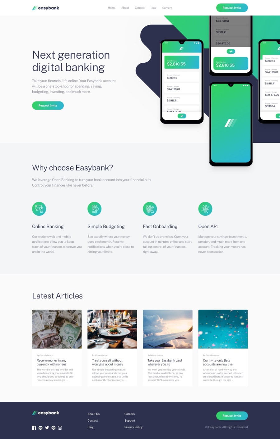
Design comparison
SolutionDesign
Solution retrospective
Pretty happy with this solution so far, however I would appreciate any guidance on dealing with the background on the hero section a bit better. At the moment it doesn't scale particularly well to higher resolution devices because I'm manually setting the positioning of the image, however at the moment it scales down fine and looks ok at 1080p. I'm also aware of a bug with the navbar but that will be fixed.
Community feedback
Please log in to post a comment
Log in with GitHubJoin our Discord community
Join thousands of Frontend Mentor community members taking the challenges, sharing resources, helping each other, and chatting about all things front-end!
Join our Discord
