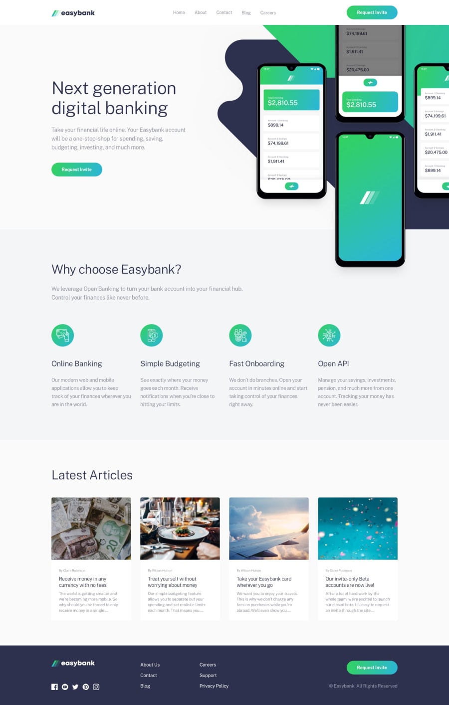
Design comparison
Solution retrospective
Any feedback most welcome! I really struggled with the layout and positioning of the background image of the introduction section here.
I think it took me as long to get to a "just about OK" working solution on that part as the rest of the page put together. Any advice on that would be especially welcome!
Community feedback
- @tedikoPosted over 3 years ago
Hello, Dave! š
You did a great job on this challenge. There's not much I can say! :D I found a little bug on Firefox. Focus on
.grid
cards is seems to be glitched, it is working good on Chrome tho. Since your.image
with mockup is is decorative youralt
text should be provided empty (alt="") so that they can be ignored by assistive technologies, such as screen readers. One more thing - after mobile menu is open you should disable scroling.Good luck with that, have fun coding! šŖ
1@JunjiequanPosted over 3 years ago@tediko
lucky me, i found this usefull information regarding alt="" for decorative image
0@dwhensonPosted over 3 years ago@tediko Thanks for the feedback - much appreciated! I'll check out that bug on firefox nice to know about these things. I didn't check it. I've been back and forth about stopping scrolling when the burger menu is open, but I think I'm OK with it being allowed as it's less likely that people get stuck in it.
0
Please log in to post a comment
Log in with GitHubJoin our Discord community
Join thousands of Frontend Mentor community members taking the challenges, sharing resources, helping each other, and chatting about all things front-end!
Join our Discord