Design comparison
SolutionDesign
Solution retrospective
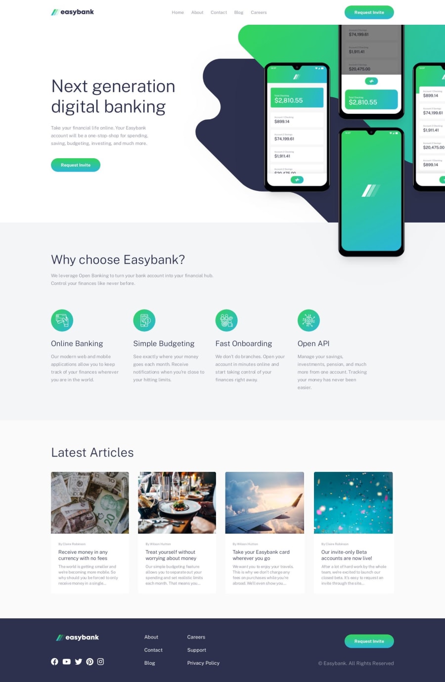
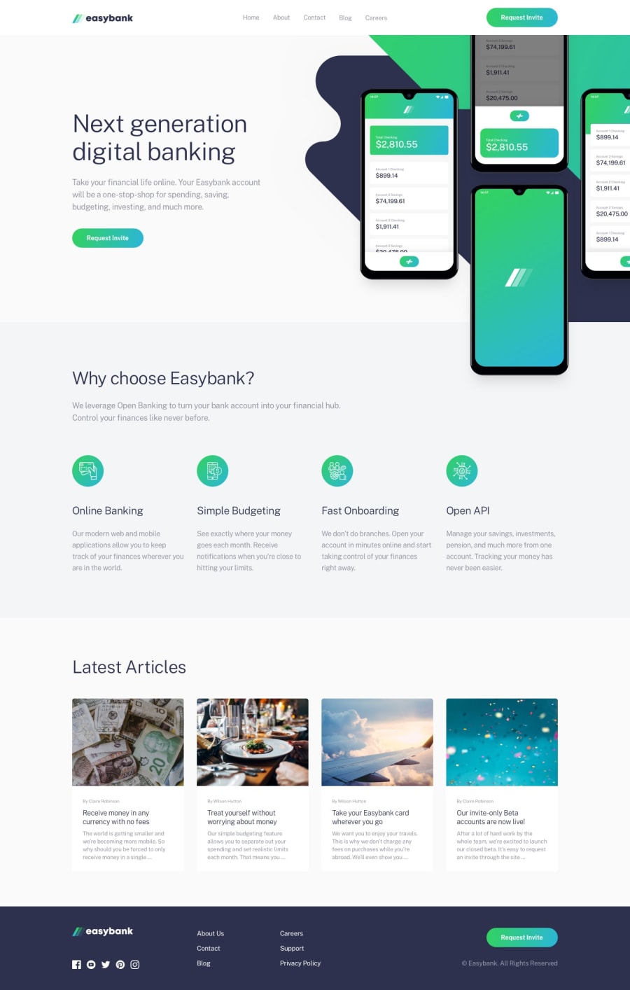
Hello everyone ;) This is my solution for this challenge, I must say that I encountered difficulties in arranging the svg images of the Hero section, especially regarding the desktop view, in which the mockup phone svg is present which overlaps with the section below. I had overflow problems initially..
Tell me what you think, and if you find that my solution is adequate or if I could have done better... for any info/questions/constructive criticism I'm here and I'll be happy to discuss it ;)
Community feedback
Please log in to post a comment
Log in with GitHubJoin our Discord community
Join thousands of Frontend Mentor community members taking the challenges, sharing resources, helping each other, and chatting about all things front-end!
Join our Discord
