Submitted about 2 years ago
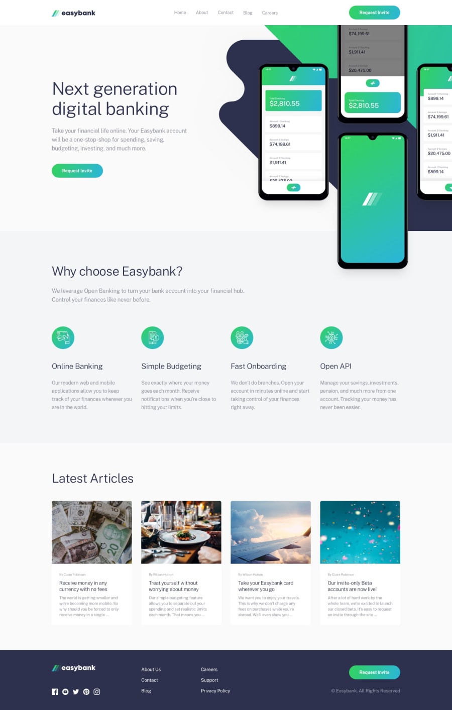
Easybank Landing Page | HTML | CSS | JavaScript
@Semi-Square
Design comparison
SolutionDesign
Solution retrospective
My first attempt at an intermediate level design. Once again, this is only for practice. I feel like there are places I could have done better on the responsive end. Please feel free to comment and give your feedback!!
Community feedback
- @Ibarra11Posted about 2 years ago
One improvement you can make is to make the images in the articles section responsive. They start getting distorted when you start scaling down the viewport. One easy thing you can do to make your images more responsive is to add object-fit: cover. Now your images will scale better when the viewport changes.
1
Please log in to post a comment
Log in with GitHubJoin our Discord community
Join thousands of Frontend Mentor community members taking the challenges, sharing resources, helping each other, and chatting about all things front-end!
Join our Discord
