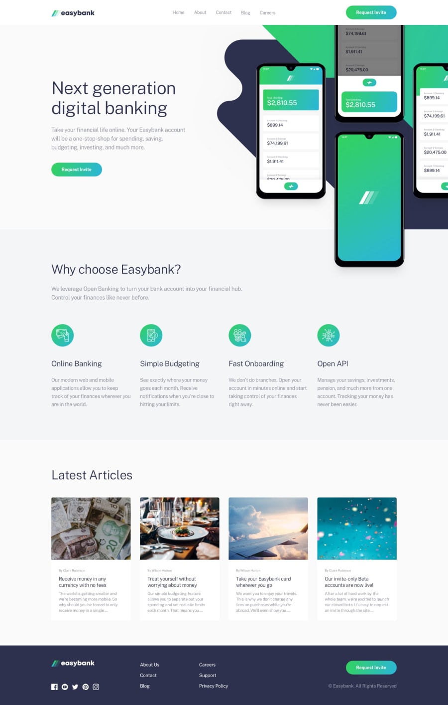
Easybank Landing Page - Grid, CSS Animations, JS, SCSS
Design comparison
Solution retrospective
Hi, everyone! 👋 Glad to finally be done with this one(I hope)!
Questions:
- When I uploaded my solution to Vercel, I noticed that on desktop the background image on the hero was loading slower and showing up halfway through the animation. I used this handy solution from CSS Tricks to pause the animations until the images were loaded. It seems to have worked for me, but let me know if there’s any weirdness. 🤞 Are there better ways to go about delaying animations until all elements are loaded?
- For accessibility, I again made sure to put the mobile menu button inside the nav, added an aria-label, as well as used the aria-expanded attribute as I did in the Loopstudios solution. Is this the correct way to go about this? Could accessibility be improved? Any insight is appreciated.
“Extras”
- The mobile menu will close if clicking outside the menu or header (as well as by using the menu button, of course).
- I played around with CSS animations on the hero section, with different animations for mobile and desktop.
Thanks for taking the time to look at my solution! Feedback is greatly appreciated. 😄
Community feedback
- @darkshadowultimatePosted over 3 years ago
Hi Anna, I really love your landing page 😍.
I’d have two suggestions if you don’t mind:
- I’ve seen that you focus even on accessibility, so I think that it would be better if the buttons “Request Invite” could have a different hover effect, because as it is right now, the contrast between button’s background and button’s text is not maintained and the text is difficult to read (for someone who has difficulties to read)
- I’ve noticed that there’s a slight tremble on the hover effect of the cards under the section “Latest Articles”. I dunno what it is, but I wanted to point that out in case if you hadn’t noticed 😉.
Anyway, really good job. I hope that with some more practice I’ll reach your level.
3@brasspetalsPosted over 3 years ago@darkshadowultimate Thanks for taking the time to look at my solution and give feedback! I really appreciate it. 😄
- Good catch on the weird shifting. 👍 It only happens in Chromium browsers, but I think I've fixed it now by adding
backface-visibility: hidden
to the article cards. - I agree with you on the hover states, but was just following the design of the challenge's active states. I'm sure for proper accessibility the contrast there would need to be changed, as well as some of the hover states (the bright green hover on the article title links isn't easy on the eyes, for example). I know "just following the design" isn't a good excuse though, and I will definitely dig more into color accessiblity - thank you!
0 - @ApplePieGiraffePosted over 3 years ago
Greetings, yet again, Anna! 👋
Well done (of course)! 👍 I really like the animations you added to your solution and the extra details you implemented (such as making the mobile menu close when the background is clicked and the attention you gave to making your solution accessible) are great! 🙌 I noticed you used more CSS grid to layout things on the site, so I take you're becoming pretty comfortable with it, now! 😀
I suggest,
- Well, actually, I don't have anything to suggest. Everything seems pretty good to me! 😆
Haha, keep coding (and happy coding, too)! 😁
2@brasspetalsPosted over 3 years ago@ApplePieGiraffe Thank you! It was actually a personal challenge of mine to only use grid for this solution. I've definitely gotten comfortable with it, finally. 😄 The mobile menu thing was a bit of pratice for future projects that'll use modals (i.e. the crowdfunding challenge, which might be the one I do next).
Thanks again for taking the time to provide feedback and encouragement - it really helps keep motivated. Happy coding to you too - looking forward to your next solution!
1 - @RocTanweerPosted over 3 years ago
Hello Anna, I have seen some of your work and wondered if you could give me few tips to improve my front-end skill and specifically how you make projects pixel perfect....please...
1@brasspetalsPosted over 3 years ago@RocTanweer I'd be glad to look at your projects and give you some feedback.
As for my (not quite) pixel-perfect solutions, I was recently asked this by someone else, so will copy/paste most of that reply here. Now, I want to preface this by saying that this probably is not the BEST way to go about things (it might, in fact, be a HORRIBLE way to go about it), and the argument has been made that you shouldn't worry so much about your solutions being pixel-perfect. However, this how I check. Since I'm not a pro member, I don't have access to the design files to have the font sizes, margins, etc. available to me. That said...
When I first started, I would just have the design image up in another tab and going back and forth...a LOT.
What I do now, after coding up a section, is to set the
background-image
of thebody
as the design image, and set thebackground-size
to match the width of the design image (example: for mobile it would be375px auto
). Then I set the opacity to something like 0.5. To make it simpler, this is basically what I put in the body when I want to check to see how close my solution is:background-image: url("./design/mobile-design.jpg"); background-size: 375px auto; background-repeat: no-repeat; opacity: 0.5;
Then I use the browser's responsive design mode, set it to 375px or 1440px (whichever layout version I am checking), and look to see how I'm doing. I then play around in the dev tools, tweaking the css to see where I can match things up better. I do my best to look for patterns. For example, all the headings and spacing in the Loopstudios project seemed to be factors of 8, which helped me a lot when choosing font sizes and margins for the medium layout. It took me a while before I figured that out though. 😅
Anyway, it's still a lot of trial and error - and a lot of eye strain. 😂 I believe some community members use a plugin called "Pixel Perfect", which I think works basically the same way?
While my solutions are close, they're never actually 100% pixel perfect. The main thing is to make them close, while having everything respond and interact well. Functionality first! Plan out your layout and the semantics you want to use. Think first about how everything will have to transition between mobile and desktop. You can always go back in and make tweaks to font sizes and all that later.
Sorry this was so long! I hope I'm not spreading a bad habit here! 🙈
2@RocTanweerPosted over 3 years ago@brasspetals please don't say bad habit...😅 I really appreciate your words and will try your way of doing this and hope to make as pixel perfect as possible...!
0 - @rstrong810Posted over 3 years ago
Hello Anna, I am very impressed with your landing page. You did an amazing job putting it together. I just started learning web development about 6 months ago and after seeing what you did with this landing page I am inspired to keep learning. If you don't mind me asking, I was wondering how long you've been doing frontend development?
1@brasspetalsPosted over 3 years ago@rstrong810 Thank you so much for the kind comment, and I'm glad to hear that my solution could give you some inspiration! 😄 If you really want to see some creative and inspiring solutions, I suggest checking out ApplePieGiraffe's work. Their solutions really inspire me to try things out of my comfort zone and to do my best with these challenges.
I've been learning web development off and on for longer than I'd like to admit. Often I've had to go back and relearn things because I've totally forgotten them during breaks in my learning.😅 My path hasn't been linear or consistent partly due to some major life events. However, these Frontend Mentor challenges have been what has really helped me develop my skills and keep me engaged. You can look back to my first solutions from this past October and see how far I've come. Actually coding projects(as opposed to just following along with tutorials - which, don't get me wrong, is a great and useful learning tool, but very different from having to do things on your own), getting feedback, and reviewing other people's solutions has very much accelerated my learning. Time is a funny measurement for learning, since we all learn at different paces. As long as you keep learning and growing, that's the main thing. 👍 Although if you did want me to to share some courses or resources that I've found really helpful, I'd be happy to do so!
Thanks again for taking the time to look at my solution and for your kind words. Hope this wasn't too long of an answer! 😅
2@rstrong810Posted over 3 years ago@brasspetals Yeah I'm glad I found this website to get some experience putting things together with what I'm learning. I would greatly appreciate any courses or resource recommendations that you have to share.
0@brasspetalsPosted over 3 years ago@rstrong810 Not sure where you are in your learning, so you might already be too advanced for some of these, but I’ll link them because you never know. There’s also a great resource page on this site, although I’m sure you’ve checked that out already.
A quick note on Udemy courses: They go on sale very often, and I’ve never paid more than $10-$15 for a course. I also suggest watching preview videos from each course (there’s usually one or two per section) or looking at a free course from that instructor to see if you like their teaching style before jumping in. You can always learn everything for free, so please don’t feel the need to spend money on a course just because I suggested it. 😅
- Jonas Schmedtmann’s courses on Udemy are really great. His website also has a nice resource page where you can also sign up for his monthly resource newsletter.
- Angela Yu’s Web Development Bootcamp on Udemy is also good. She has a youtube channel as well where you can get more of an “extended preview” of her courses and see if you like her style.
- freeCodeCamp: I’m sure everyone knows about this one already, but it’s still good. I learn a bit better with audio/video, so reading through everything wasn’t my favorite, but I love the “hands-on” challenge nature of it.
- I’m often referring back to this article on sectioning html when doing these projects. CSS-Tricks is such a wonderful site in general.
- Can I Use is a great site to check for browser support for different features.
There’s so many great resources out there it’s actually a bit overwhelming. I’ve heard great things about Wes Bos’s courses as well, and I know he offers a lot of free courses/resources. Oh! The CSS Diner game is fun, and taught me a bunch of selectors I had no idea existed. Anyway, I think I’ve probably written too much again as usual. Hopefully some of these will be helpful for you.
0
Please log in to post a comment
Log in with GitHubJoin our Discord community
Join thousands of Frontend Mentor community members taking the challenges, sharing resources, helping each other, and chatting about all things front-end!
Join our Discord