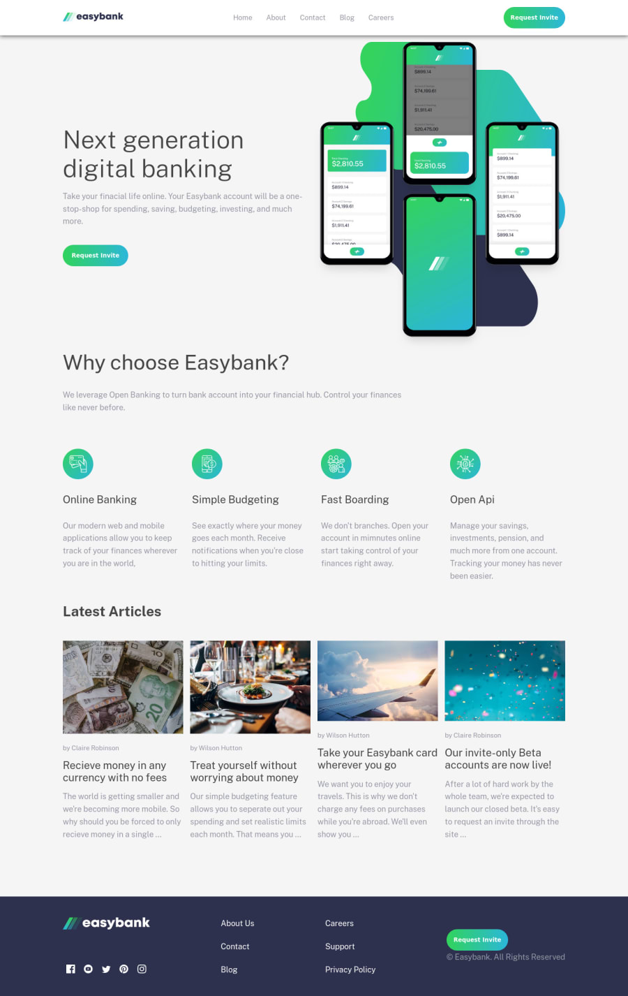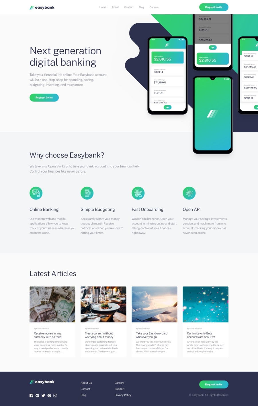
Easybank Landing Page featuring HTML, SASS and Javascript.
Design comparison
Solution retrospective
Everyone's feedback is always appreciated..
Community feedback
- @FluffyKasPosted over 2 years ago
Heyo,
It looks pretty good on mobile and desktop screens. I feel like the sizes in between could be a bit smoother (you could adjust the media query a bit to switch at a different size or perhaps add different queries for the different sections). There are some other issues, smaller and bigger as well you may want to look into:
-
Regarding your Sass/css: it feels like you're abusing nesting a bit which makes your code really hard to read. For example: if you name your module "footer.scss" I think it's somewhat unnecessary to nest every single element inside footer in the file itself. You'll end up with a bunch of }}} in your code that is hard to sort out. You're also following some strange practices to target elements: "div.header-intro-paragraph", "img.bg-intro-desktop". I don't really see the reason why you combine element selectors with class selectors. Class selectors in themselves should be specific enough, combining the two seems confusing. If you have any reason to do things this way, please let me know because I'm really curious!
-
Your nav links should be wrapped in <li>s and contained by a <ul> instead of a div. I'm also not sure how good of a practice it is to have a separate desktop and mobile menu in your markup.
-
Your buttons are using the browser's default font, so their font-family need to be overwritten ^^
-
I suggest reading this article, it helps a lot to understand what alt texts are for and how to write useful ones.
-
In the Why Choose Easybank sections, your labels should be swapped with headings. Labels are for labeling form elements, like inputs, checkboxes, textareas, etc.
-
Article section: You could swap these divs with articles, it's the perfect use case for the <article> element. Instead labels, use headings here too!
-
Social links: instead of alt texts, aria-labels would be perhaps a better choice! They could also be wrapped in <ul>, just like your nav links. Same goes for the other footer links!
Sorry for the wall of text, I hope it was somewhat useful at least >.< All in all, I think you did good on a really tough challenge! It's just the markup and clean coding practices that you might want to work on a bit. Good luck!
Marked as helpful1@i-am-KhaelPosted over 2 years ago@FluffyKas Thanks for the feedback.
"div.header-intro-paragraph" no doubt this is strange, just my personal preference. Haha
I will read that article you provide..
0 -
Please log in to post a comment
Log in with GitHubJoin our Discord community
Join thousands of Frontend Mentor community members taking the challenges, sharing resources, helping each other, and chatting about all things front-end!
Join our Discord
