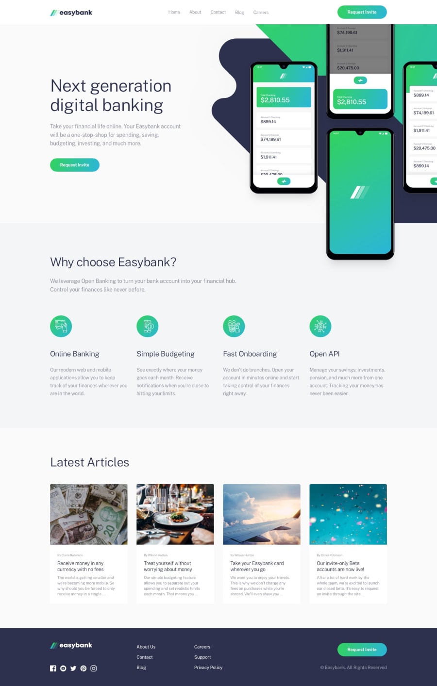
Design comparison
SolutionDesign
Solution retrospective
What are you most proud of, and what would you do differently next time?
I am really proud of the overall responsiveness on this solution. The design worked really well with Bootstrap.
What challenges did you encounter, and how did you overcome them?I really struggled with the positioning of the hero image. It is really hard to position them right and at the same time responsive.
What specific areas of your project would you like help with?Any tips or tricks on positioning images with absolute positioning (or alternatives) are very welcome!
Community feedback
Please log in to post a comment
Log in with GitHubJoin our Discord community
Join thousands of Frontend Mentor community members taking the challenges, sharing resources, helping each other, and chatting about all things front-end!
Join our Discord
