Easybank Landing Page | Astro - Typescript - Postcss
Design comparison
Solution retrospective
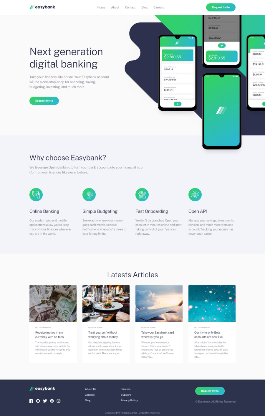
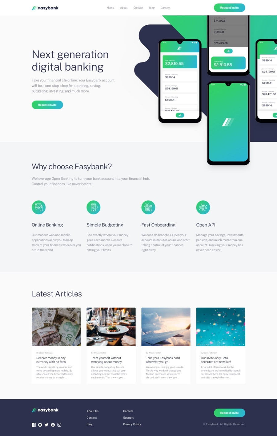
Hello everyone 😊 This is my solution for the Easybank Landing Page challenge.
The main difficulty in this project is the hero images. I am not 100% pleased with the result I got but it works so i guess it is good enough.
I think the design itself is not the best. Some fonts are too small for good accessibility IMO and the spacing is highly inconsistent between each section/component. IRL I would have try to talk to the designer in the team about these.
Feel free to share any advice/improvements you would like to see implemented in the code.
Thank you for your time. Have a nice day/night. Peace 😊
Community feedback
- @VCaramesPosted about 2 years ago
Hey @AntoineC-dev, great job on this project!
Some suggestions to improve you code:
-
For media queries, I definitely suggest using em for them. By using px your assuming that every users browser (mobile, tablet, laptop/desktop) is using a font size of 16px (this is the default size on browser). Em's will help with users whose default isn't 16px, which can sometimes cause the your content to overflow and negatively affect your layout.
-
When using buttons/links alongside the “hover” effect, you’ll run into the problem where the hover effect gets “stuck”. To prevent this, you’ll want to add the @media (hover: hover) to your CSS code and include within the query all the classes that are using the hover effect. Since not all devices support hover effects this query will then check to see if it is or not.
Happy Coding!
Marked as helpful0@mattari97Posted about 2 years ago@vcarames Thank you for your feedback. I made the changes. Peace 😊
0 -
Please log in to post a comment
Log in with GitHubJoin our Discord community
Join thousands of Frontend Mentor community members taking the challenges, sharing resources, helping each other, and chatting about all things front-end!
Join our Discord
