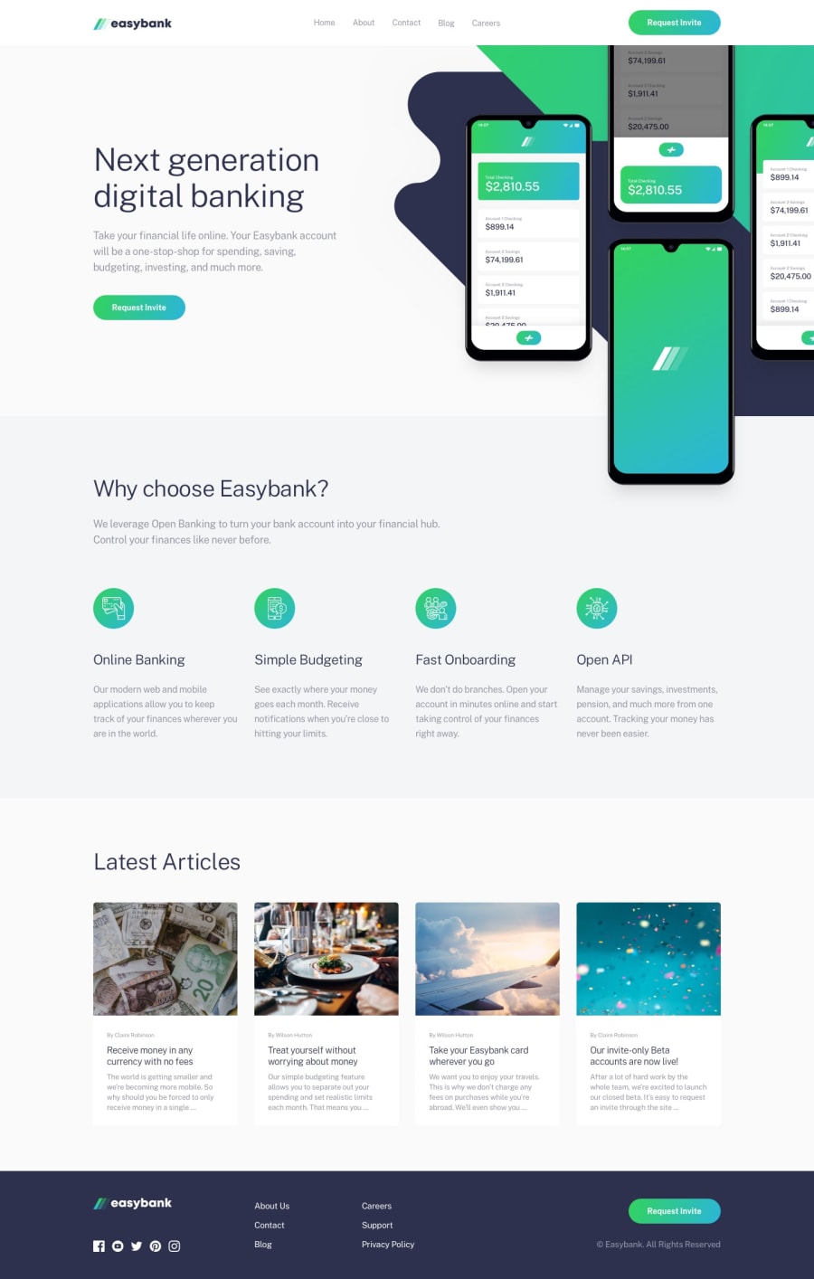
Design comparison
Solution retrospective
🕓≈ 4h
Community feedback
- @bravonoPosted about 1 year ago
Hi Enzmrg
Great job!
Something that stood out when I looked at your solution was the position of the phone mockup. I can see that is behind the "Why Choose Easybank" component.
The property you need to fix this problem is the "position: absolute" property. Note that the parent container has to be set to "position: relative". With these changes, you should be able to position your mockup however you like.
Also, note that it can be challenging to get it right even with the property I just mentioned.
I almost forgot that you also need to set the "z-index: 999". The 999 is arbitrary but you want to set it to a high number to make sure that the mock moves ontop.
I hope this helps!
Marked as helpful0@enzo-mirPosted about 1 year ago@bravono Thanks ! I forgot this, I didn't see my preview thanks you !
1
Please log in to post a comment
Log in with GitHubJoin our Discord community
Join thousands of Frontend Mentor community members taking the challenges, sharing resources, helping each other, and chatting about all things front-end!
Join our Discord
