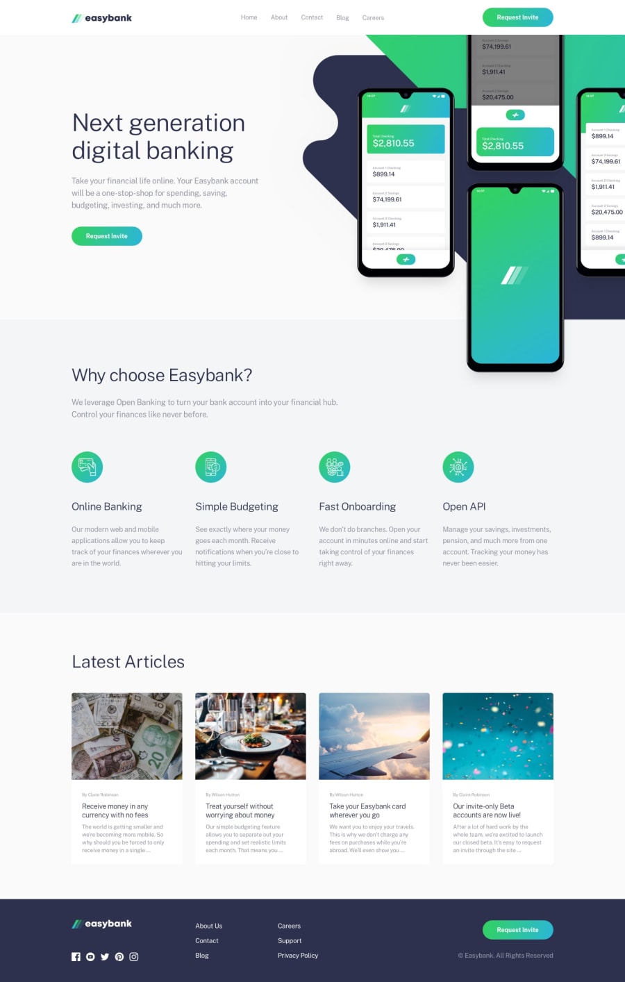
Design comparison
SolutionDesign
Solution retrospective
Hello, this is my next project. I feel like this one turned out a bit messy, mostly the article section as I had to do extra things or the text would overflow from the div box instead of being contained. If anyone has any tips or feedback, that would be really appreciated.
Community feedback
Please log in to post a comment
Log in with GitHubJoin our Discord community
Join thousands of Frontend Mentor community members taking the challenges, sharing resources, helping each other, and chatting about all things front-end!
Join our Discord
