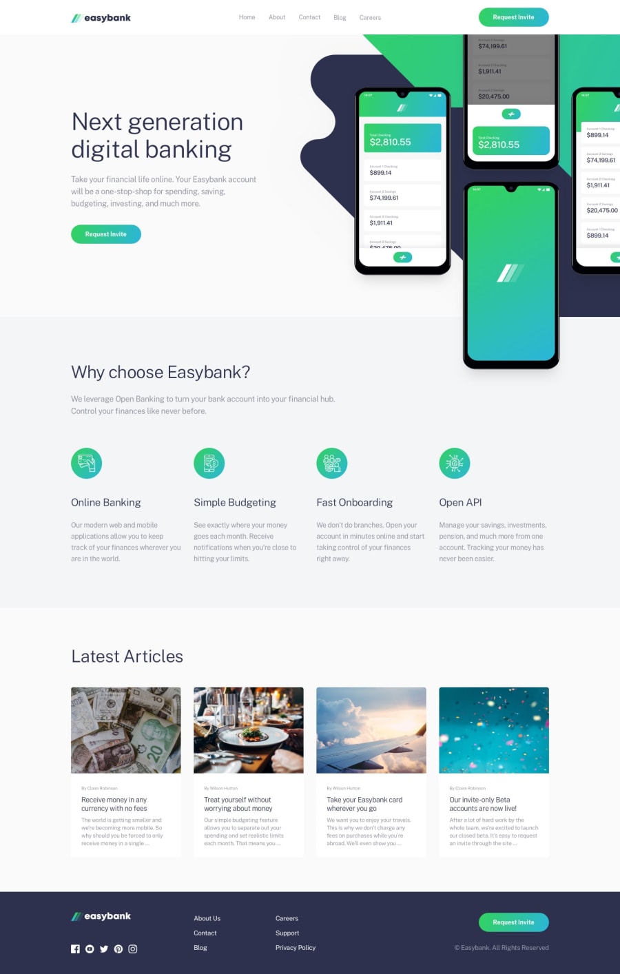
Design comparison
Community feedback
- @grace-snowPosted about 4 years ago
One more thing from looking at css. Are you only triggering a layout change at 1440px and nothing earlier? I'm only viewing on mobile right now, but that would be larger than my desktop resolution, so you may want to reduce that.
I'm also curious about your decisions around css - sometimes youre styling off classes, sometimes ids, sometimes nested, sometimes elements... Its not necessarily bad, but it's certainly unusual to do this because of the specificity implications. If I saw this in an applicants code, I would ask about what's behind these kind of decisions. It's helpful to understand the thought process and reasons why 😊
Well done on this though, it looks nice
1@leonelmequePosted almost 4 years ago@grace-snow Thank you Grace, I actually started using more classes instead of Id's for styling and BEM.
0 - @grace-snowPosted about 4 years ago
Hi,
Viewing on mobile, it looks like you're missing the dark blob/background at the top that I can see in the design.
The rest looks really nice layout-wise. You just need to sort out the accessibility now with things like
- making the mobile menu live in an interactive element and associating that control to the state of the menu
- heading levels in order
- semantic html elements for layout and more
That stuff will give this a nice polish if you ever want to use it for a portfolio piece.
1
Please log in to post a comment
Log in with GitHubJoin our Discord community
Join thousands of Frontend Mentor community members taking the challenges, sharing resources, helping each other, and chatting about all things front-end!
Join our Discord
