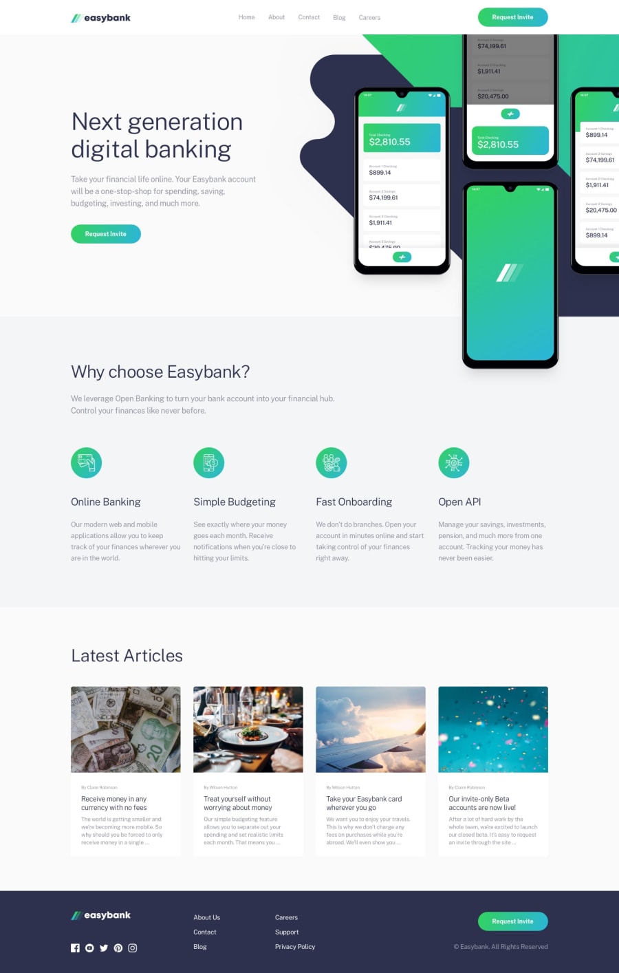
Design comparison
Solution retrospective
Any feedback will be appreciated. Thanks!
Community feedback
- @nasrattPosted over 4 years ago
Wow, Great Job. Really beautiful
1 - @DanielGibsonOrchidPosted over 4 years ago
Hi Abdullah, Great work on the Easybank project, it looks good.
Two bits of feedback I would give are these:
-
It's important to get all of the content aligned correctly so the eye can follow it easily, some of your text is center aligned while other parts are left aligned. An easy way to fix this is to place text content within container div's, then on that container set a max-width and text-align left (or center for mobile).
-
Second, it's much easier to manipulate images into the right position if they are set to position: absolute then set a width and top & left alignment
If you like you can check out my solution to easybank and see how I've done these
1@mahin-abdullahPosted over 4 years ago@DanielGibsonOrchid Thank you so much for your feedback! I'll be gladly checking out yours! Much love.
0 -
Please log in to post a comment
Log in with GitHubJoin our Discord community
Join thousands of Frontend Mentor community members taking the challenges, sharing resources, helping each other, and chatting about all things front-end!
Join our Discord
