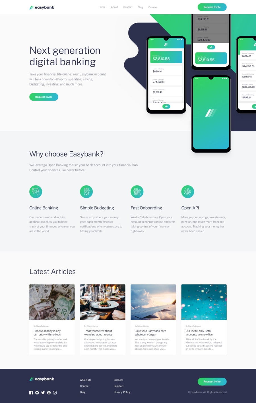
Design comparison
Community feedback
- @mstankaPosted over 4 years ago
Hi, you did a great job with this challenge. Your code is well structured and easy to follow. I learned from your code that I can use 'setAttribute' to change the icon for mobile navigation. I miss this possibility somehow. So, thanks for it. And keep coding :)
1 - @mattstuddertPosted over 4 years ago
Awesome work, Samaila! You've done a really good job on this challenge 👍
Have you ever tried using
min-widthmedia queries instead ofmax-width? It's quite a common workflow with front-end developers to use them and work mobile-first. It can often lead to less CSS code and has the benefit of loading in fewer styles for mobile users, which can be a nice performance gain.Keep it up! 🥳
0@sa-maPosted over 4 years agoThank you Matt, I'll try that for my next project @mattstuddert
0
Please log in to post a comment
Log in with GitHubJoin our Discord community
Join thousands of Frontend Mentor community members taking the challenges, sharing resources, helping each other, and chatting about all things front-end!
Join our Discord
