Design comparison
SolutionDesign
Solution retrospective
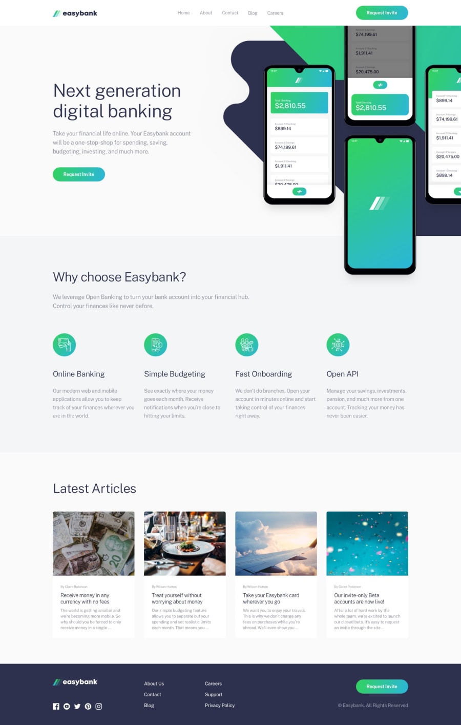
While building this page, the two mockup images that are at the left were pretty hard to insert them just the they are added at the design photo.
Most of the problems for me were these images. Still, I didnt came to the solution how to put them ideally because they would widen my page and I couldnt come to the best looking solution.
My final solution was to make the mobile little smaller than the original.
What was your solution? How do you overcome this kind of problem?
Community feedback
Please log in to post a comment
Log in with GitHubJoin our Discord community
Join thousands of Frontend Mentor community members taking the challenges, sharing resources, helping each other, and chatting about all things front-end!
Join our Discord
