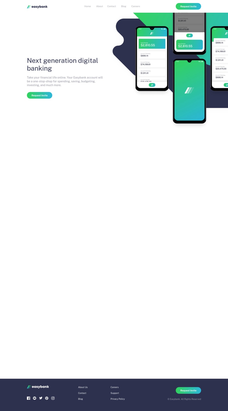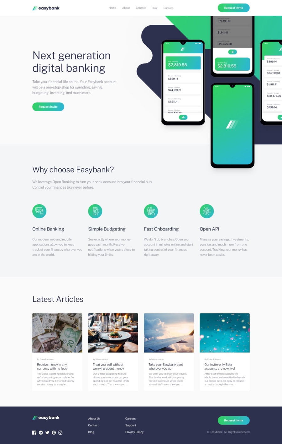
Design comparison
Solution retrospective
I would appreciate any feedback, especially regarding transitions.
Community feedback
- @FluffyKasPosted over 2 years ago
Hiya,
It looks really nice, well done! I only have a few small suggestions for you:
-
Instead of giving an alt text to the mobile menu button's image, I'd perhaps hide the image itself and add the same text as an aria-label to the button.
-
The card <div>s inside the article section could be swapped with <article>. It's also perhaps not the best if the alt text of those article images are just repeating the article's title, it causes repetition if a screen reader reads them out. I think they're mostly just decorative images, so you may as well add an aria-hidden="true" to these too.
-
I'm not sure object is the best solution for the social media links. I never used an object element before, but it might be a completely valid solution (although an img wrapped in <a> seems easier). It still needs to have some sort of text description because not everyone can see the images ^^
-
A short transition on the buttons and links would look nice!
1@lucasfernandodevPosted over 2 years ago@FluffyKas Thank you very much for the feedback
0 -
- @NAZIRwill29Posted over 2 years ago
Hi @lucasfernandodev
It was really great website. How do you make the hover effect for the
menu-link? Do you make it change themenu-link::after?I just have one suggestion for you:
- better add
animation: transitionfornavigationafter and before the click event so it will make the smooth transition.
0@lucasfernandodevPosted over 2 years ago@NAZIRwill29 Thanks for the feedback, the
.menu-item:hovereffect and a width animation on themenu-link::afterpseudo-element.0 - better add
Please log in to post a comment
Log in with GitHubJoin our Discord community
Join thousands of Frontend Mentor community members taking the challenges, sharing resources, helping each other, and chatting about all things front-end!
Join our Discord
