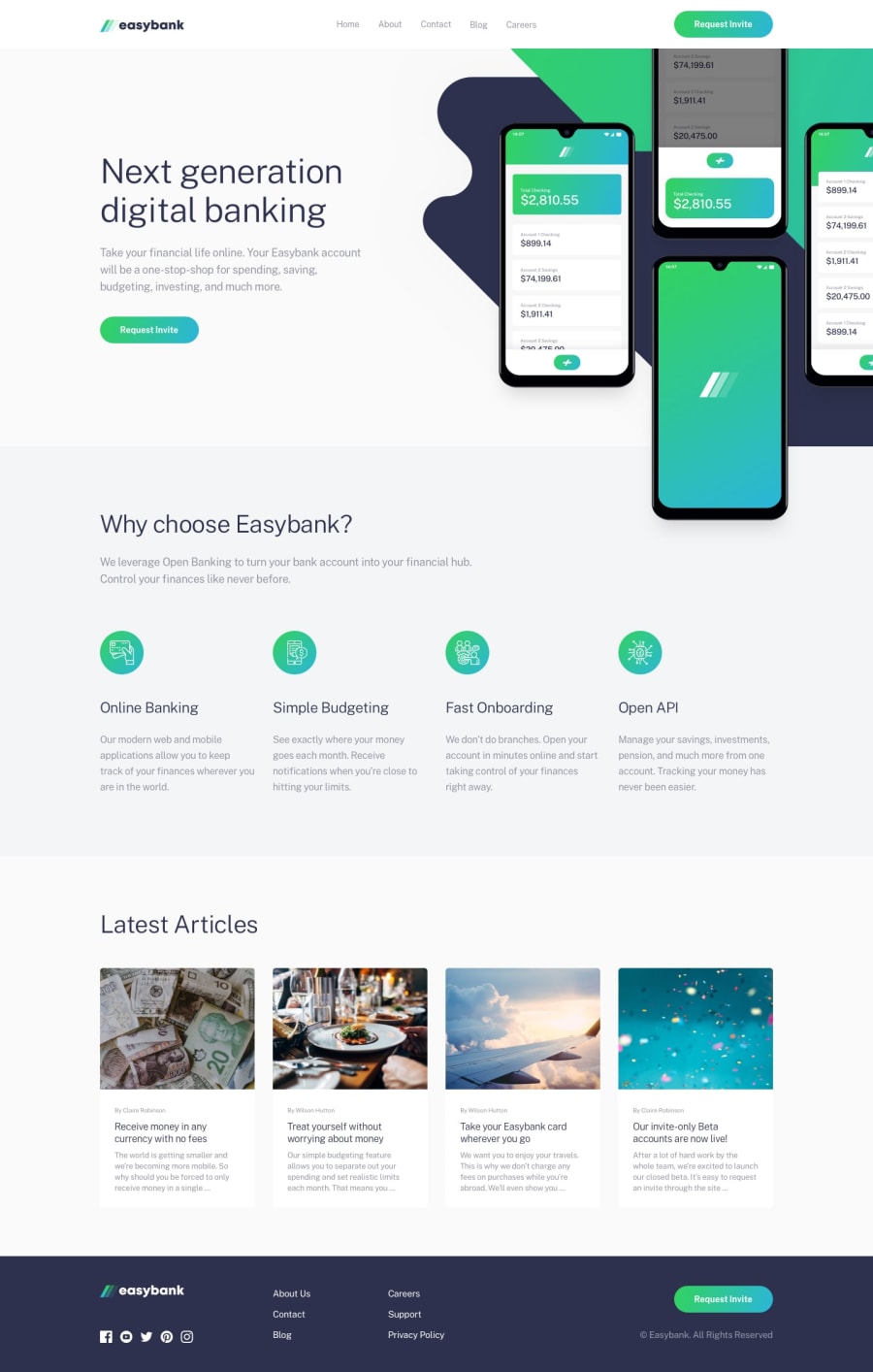
Design comparison
SolutionDesign
Community feedback
- @AphatheologyPosted over 2 years ago
Great job, glad you also used SCSS for this challenge.
Things to fix: On mobile or smaller screen, the navbar items is not showing when the hamburger is toggled, it is behind the hero section image. Kindly look into that.
Aside that, every other thing is perfect and lovely.
Marked as helpful0
Please log in to post a comment
Log in with GitHubJoin our Discord community
Join thousands of Frontend Mentor community members taking the challenges, sharing resources, helping each other, and chatting about all things front-end!
Join our Discord
