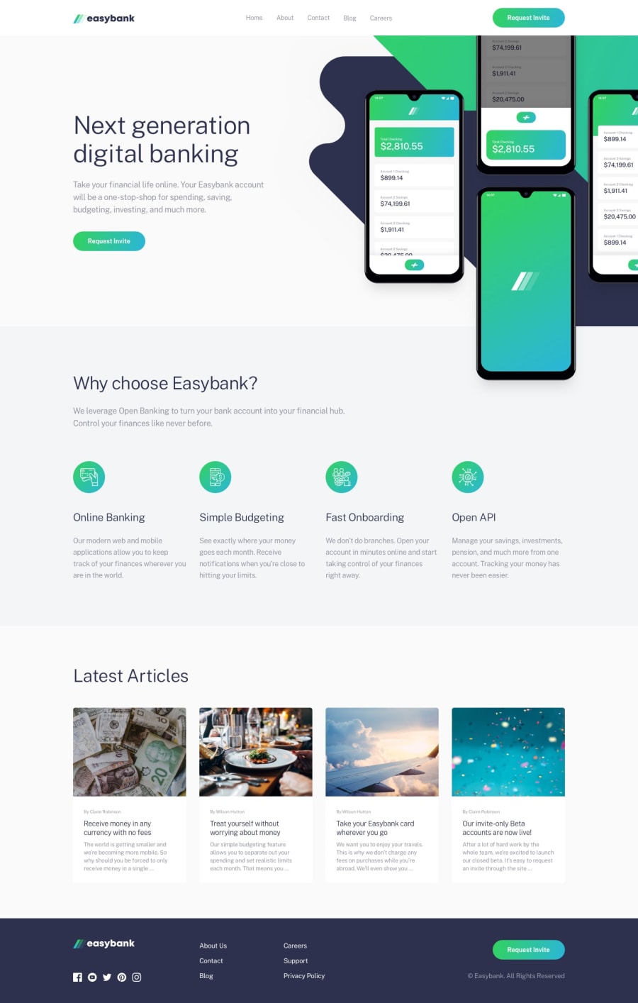
Design comparison
SolutionDesign
Solution retrospective
Nothing new with this one, another landing page, pretty fun to make because of all the flex elements.
If you, like me, are struggling with the header picture, don't forget you need to set a position to your div (I used position: relative) to give it a Z-index. Makes everything way simpler.
Community feedback
Please log in to post a comment
Log in with GitHubJoin our Discord community
Join thousands of Frontend Mentor community members taking the challenges, sharing resources, helping each other, and chatting about all things front-end!
Join our Discord
