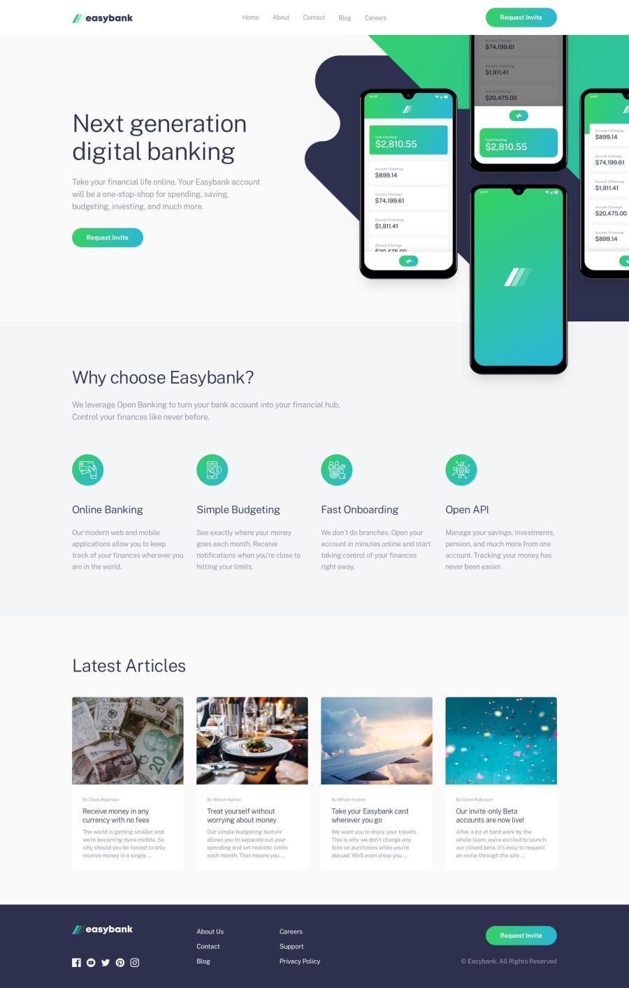
Easybank Landing Page (HTML | CSS | JS Vanilla => animejs library)
Design comparison
Solution retrospective
...made with a lot of love 🤘🏻🙂
Community feedback
- @sircarloschavesPosted over 1 year ago
Hey, how do I animate a button with a gradient like you did?
1@CheospherePosted over 1 year agoHello @sircarloschaves, in this case the transition property works perfectly because I am applying opacity to animate the hover state of the button, but when you need to directly animate the gradient going from one color to another, the transition applied in the normal way does not work, to solve this problem you can use the pseudo-element property as shown in this example => Transitioning Gradients
1 - @andre1dragosPosted over 1 year ago
Can’t believe the match with the original design. Great attention to details. Congratulations awesome job!
1 - @falloumacbookPosted over 1 year ago
Wow!!! work well done. Great job i love your solution.
1 - @ChelseaChanuPosted over 1 year ago
Just wow, I found your page and I'm truly grateful, your work looks flawless. You have any tips, I want to try exactly matching the layout. Thanks for liking my project I found your page through that 😊.
1@CheospherePosted over 1 year ago@ChelseaChanu Hello bro, thank you very much for your comment, what I do is open the "desktop-design.jpg" file, in Photoshop or Illustrator, and using the ruler tool (setting its unit of measure to pixels) I can get the sizes, spaces and margins of each of the elements. The same process applies to the mobile version, which is found in the "mobile-design.jpg" file. You can also access the files in Figma, but for that you need to get the Pro version of Frontend Mentor. The truth is that I am obsessed with making my development as close as possible to UI design, this causes me terrible stress hahaha and also many hours of work on fine details, but I like doing it that way.
3 - @LifeofPaksPosted over 1 year ago
Brooo i just had to peep your solution on this project. its perfect. I'm curios tho, the layout is exact, how did you accomplish this?
1@CheospherePosted over 1 year ago@LifeofPaks Hello bro, thank you very much for your comment, the truth is that I am obsessed with making my development as close as possible to UI design, this causes me terrible stress hahaha and also many hours of work on fine details, but I like doing it that way . When I compare my development with the UI design, I see that there are some small differences, but the image capture generated by the platform has favored me, and in this case those differences go unnoticed.
1 - @chukwudobe-MicahPosted about 2 years ago
Hey Cheosphere, it's been a while you've been here. Hope you're good?
1@CheospherePosted about 2 years agoHello @chukwudobe-Micah, I hope you are very well.
A while ago I got my first job as a Jr. front-end developer, that's the reason for my absence on the platform, but I'm doing great, and now I just uploaded a new challenge to the platform =)
0@chukwudobe-MicahPosted about 2 years ago@Cheosphere aww, congrats man!!!!!!!!
I had a feeling you might have gotten a job, I guess my instincts were right.😅
I hope this is me soon, congrats again.
1 - @Galaxy159Posted about 2 years ago
Omg your solutions are flawless bro! I think it would be a good idea to learn some framework like React at this point.. Great job!
1 - @bekzodturgunoffPosted 12 months ago
It's not negative comment but why does it seem like it's lagging I mean the animation
0
Please log in to post a comment
Log in with GitHubJoin our Discord community
Join thousands of Frontend Mentor community members taking the challenges, sharing resources, helping each other, and chatting about all things front-end!
Join our Discord
