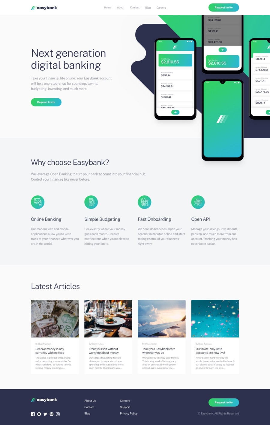
Design comparison
SolutionDesign
Solution retrospective
I got my self into a lot of trouble lately since i've started to learn React, i found this challenge a good practice inherent to my current chapter on udemy so I did it, let's see how many errors i have.. and if you have any recommendations sure send it on
Community feedback
- @adarshcodesPosted over 4 years ago
Hey! @Vincenzo Marcovecchio, You did a nice job on this solution👍. Let's see your solution from many aspects🙂
- Design aspect
- Your design looks great, I like the way you added hovering effect to the buttons and the links😍.
- Responsiveness aspect
- Also, your responsiveness works fine and the on clicking the hamburger is great👍.
- Code aspect
- The code looks pretty clean.
- Issues aspect
- You can solve all those Accessibility and HTML issues.
2@VincenzoMarcovecchioPosted over 4 years ago@adarshcodes Hey man I appreciate your response, we are working on it :)
0
Please log in to post a comment
Log in with GitHubJoin our Discord community
Join thousands of Frontend Mentor community members taking the challenges, sharing resources, helping each other, and chatting about all things front-end!
Join our Discord
